Simple, beautiful CLI output.
Zero-dep, compositional terminal output
 layoutz
Simple, beautiful CLI output 🪶
A lightweight, zero-dep lib to build compositional ANSI strings, terminal plots, and interactive Elm-style TUI's in pure Haskell.
Part of d4 · Also in Scala, OCaml
Features
- Pure Haskell, zero dependencies (use
Layoutz.hslike a header file) - Elm-style TUIs
- Layout primitives, tables, trees, lists, CJK-aware
- Colors, ANSI styles, rich formatting
- Terminal charts and plots
- Widgets: text input, spinners, progress bars
- Implement
Elementto add your own primitives - Easy porting to MicroHs
Layoutz also lets you easily drop animations into build scripts or any processes that use Stdout:

Table of Contents
- Installation
- Quickstart
- Why layoutz?
- Core Concepts
- Elements
- Border Styles
- Charts & Plots
- Colors & Styles
- Custom Components
- Interactive Apps
- Examples
- Contributing
Installation
Add Layoutz on Hackage to your project's .cabal file:
build-depends: layoutz
All you need:
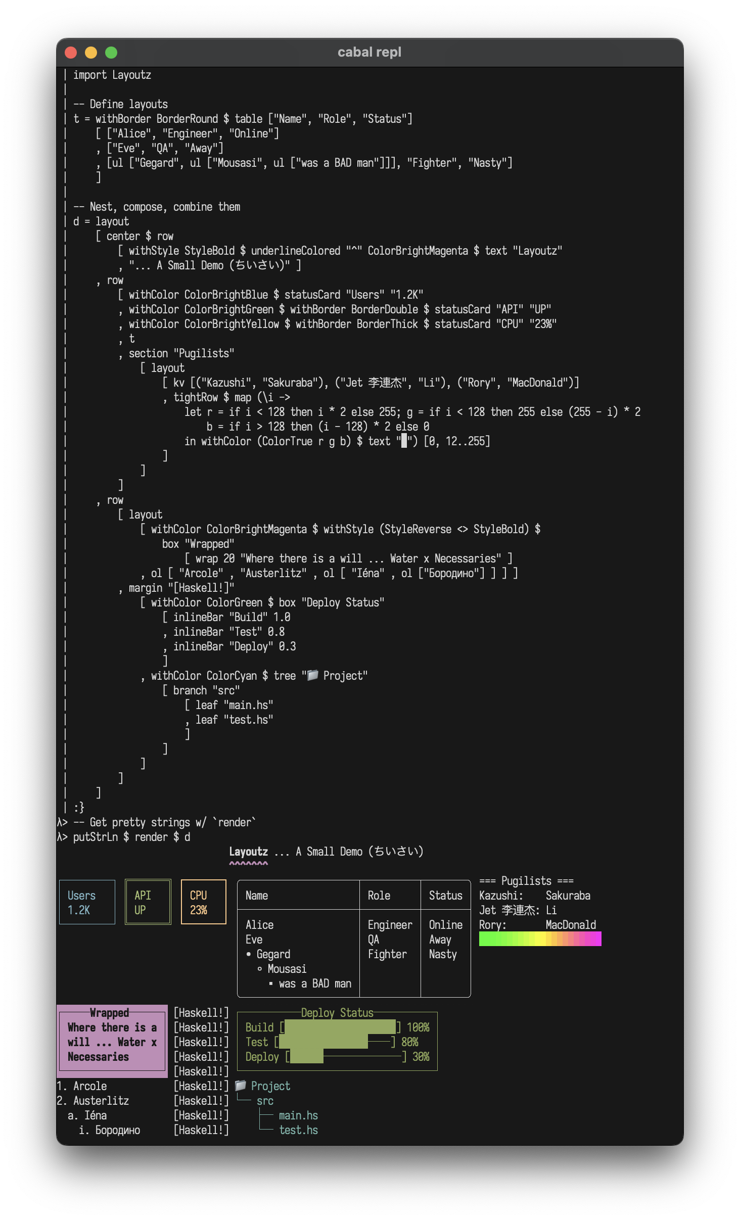
import Layoutz
Quickstart
(1/2) Static rendering - Beautiful, compositional strings:
import Layoutz

demo = layout
  [ center $ row
      [ withStyle StyleBold $ text "Layoutz"
      , withColor ColorCyan $ underline' "ˆ" $ text "DEMO"
      ]
  , br
  , row
    [ statusCard "Users" "1.2K"
    , withBorder BorderDouble $ statusCard "API" "UP"
    , withColor ColorRed $ withBorder BorderThick $ statusCard "CPU" "23%"
    , withStyle StyleReverse $ withBorder BorderRound $ table ["Name", "Role", "Skills"]
        [ ["Gegard", "Pugilist", ul ["Armenian", ul ["bad", ul["man"]]]]
        , ["Eve", "QA", "Testing"]
        ]
    ]
  ]

putStrLn $ render demo
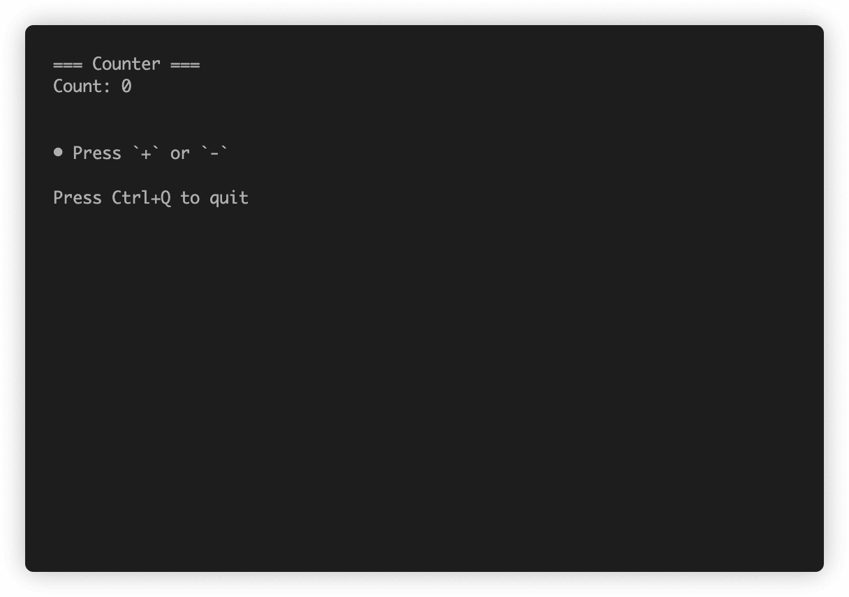
(2/2) Interactive apps - Build Elm-style TUI's:
import Layoutz

data Msg = Inc | Dec

counterApp :: LayoutzApp Int Msg
counterApp = LayoutzApp
  { appInit = (0, CmdNone)
  , appUpdate = \msg count -> case msg of
      Inc -> (count + 1, CmdNone)
      Dec -> (count - 1, CmdNone)
  , appSubscriptions = \_ -> subKeyPress $ \key -> case key of
      KeyChar '+' -> Just Inc
      KeyChar '-' -> Just Dec
      _           -> Nothing
  , appView = \count -> layout
      [ section "Counter" [text $ "Count: " <> show count]
      , ul ["Press '+' or '-'", "ESC to quit"]
      ]
  }

main = runApp counterApp
Why layoutz?
- We have
printfand full-blown TUI libraries - but there's a gap in-between - layoutz is a tiny, declarative DSL for structured CLI output
- On the side, it has a little Elm-style runtime + keyhandling DSL to animate your elements, much like a flipbook...
- But you can just use Layoutz without any of the TUI stuff
Core concepts
- Every piece of content is an
Element - Elements are immutable and composable - build complex layouts by combining simple elements
- A
layoutarranges elements vertically:
layout [elem1, elem2, elem3] -- Joins with "\n"
Call render on any element to get a string
The power comes from uniform composition - since everything has the Element typeclass, everything can be combined.
String Literals
With OverloadedStrings enabled, you can use string literals directly:
layout ["Hello", "World"] -- Instead of layout [text "Hello", text "World"]
Note: When passing to functions that take polymorphic Element a parameters (like underline', center', pad), use text explicitly:
underline' "=" $ text "Title"  -- Correct
underline' "=" "Title"         -- Ambiguous type error
Border Styles
Applied via withBorder to any element with the HasBorder typeclass (box, statusCard, table):
withBorder BorderRound $ box "Info" ["content"]
withBorder BorderDouble $ statusCard "API" "UP"
withBorder BorderThick $ table ["Name"] [["Alice"]]
Write generic code over bordered elements:
makeThick :: HasBorder a => a -> a
makeThick = setBorder BorderThick
BorderNormal                  -- ┌─┐ (default)
BorderDouble                  -- ╔═╗
BorderThick                   -- ┏━┓
BorderRound                   -- ╭─╮
BorderAscii                   -- +-+
BorderBlock                   -- ███
BorderDashed                  -- ┌╌┐
BorderDotted                  -- ┌┈┐
BorderInnerHalfBlock          -- ▗▄▖
BorderOuterHalfBlock          -- ▛▀▜
BorderMarkdown                -- |-|
BorderCustom "+" "=" "|"      -- Custom border
BorderNone                    -- No borders
Elements
Text: text
text "hello"
"hello"                                      -- with OverloadedStrings
Line Break: br
layout [text "Line 1", br, text "Line 2"]
Layout (vertical): layout
layout ["First", "Second", "Third"]
First
Second
Third
Row (horizontal): row, tightRow
row ["Left", "Middle", "Right"]
tightRow [text "A", text "B", text "C"]      -- no spacing
Left Middle Right
ABC
Horizontal Rule: hr, hr', hr''
hr                                           -- default ──────────
hr' "~"                                      -- custom char
hr'' "=" 20                                  -- custom char + width
──────────────────────────────────────────────────
~~~~~~~~~~~~~~~~~~~~~~~~~~~~~~~~~~~~~~~~~~~~~~~~~~
====================
Vertical Rule: vr, vr', vr''
vr                                           -- default: 10 high with │
vr' "║"                                      -- custom char
vr'' "|" 5                                   -- custom char + height
Box: box
box "Status" [text "All systems go"]
withBorder BorderDouble $ box "Fancy" [text "Double border"]
withBorder BorderRound $ box "Smooth" [text "Rounded corners"]
┌──Status──────────┐
│ All systems go   │
└──────────────────┘
╔══Fancy═══════════╗
║ Double border    ║
╚══════════════════╝
╭──Smooth────────────╮
│ Rounded corners    │
╰────────────────────╯
Pipe any element through withBorder:
withBorder BorderRound $ box "Info" ["content"]
withBorder BorderDouble $ statusCard "API" "UP"
withBorder BorderThick $ table ["Name"] [["Alice"]]
Status Card: statusCard
row [ withColor ColorGreen $ statusCard "CPU" "45%"
    , withColor ColorCyan $ statusCard "MEM" "2.1G"
    ]
┌──────┐ ┌───────┐
│ CPU  │ │ MEM   │
│ 45%  │ │ 2.1G  │
└──────┘ └───────┘
Table: table
table ["Name", "Age", "City"]
  [ ["Alice", "30", "New York"]
  , ["Bob", "25", ""]
  , ["Charlie", "35", "London"]
  ]
┌─────────┬─────┬──────────┐
│ Name    │ Age │ City     │
├─────────┼─────┼──────────┤
│ Alice   │ 30  │ New York │
│ Bob     │ 25  │          │
│ Charlie │ 35  │ London   │
└─────────┴─────┴──────────┘
Key-Value: kv
kv [("Name", "Alice"), ("Age", "30"), ("City", "NYC")]
Name: Alice
Age:  30
City: NYC
Section: section, section', section''
section "Status" [text "All systems operational"]
section' "-" "Status" [text "ok"]            -- custom glyph
section'' "#" "Report" 5 [text "42"]         -- custom glyph + width
=== Status ===
All systems operational
Unordered List: ul
ul ["Backend", ul ["API", ul ["REST", "GraphQL"], "DB"], "Frontend"]
• Backend
  ◦ API
    ▪ REST
    ▪ GraphQL
  ◦ DB
• Frontend
Ordered List: ol
ol ["Setup", ol ["Install deps", ol ["npm", "pip"], "Configure"], "Deploy"]
1. Setup
  a. Install deps
    i. npm
    ii. pip
  b. Configure
2. Deploy
Tree: tree, branch, leaf
tree "Project"
  [ branch "src" [leaf "main.hs", leaf "test.hs"]
  , branch "docs" [leaf "README.md"]
  ]
Project
├── src
│   ├── main.hs
│   └── test.hs
└── docs
    └── README.md
Progress Bar: inlineBar
inlineBar "Download" 0.75
Download [███████████████─────] 75%
Chart: chart
chart [("Web", 10), ("Mobile", 20), ("API", 15)]
Web    │████████████████████────────────────────│ 10
Mobile │████████████████████████████████████████│ 20
API    │██████████████████████████████──────────│ 15
Spinner: spinner
4 built-in styles:
spinner "Loading" frame SpinnerDots     -- ⠋ ⠙ ⠹ ⠸ ⠼ ⠴ ⠦ ⠧ ⠇ ⠏
spinner "Loading" frame SpinnerLine     -- | / - \
spinner "Loading" frame SpinnerClock    -- 🕐 🕑 🕒 🕓 🕔 🕕 🕖 🕗 🕘 🕙 🕚 🕛
spinner "Loading" frame SpinnerBounce   -- ⠁ ⠂ ⠄ ⠂
Alignment: center, alignLeft, alignRight, justify, wrap
center $ text "Auto-centered"                  -- width from siblings
center' 30 $ text "Fixed width"
alignLeft 30 "Left"
alignRight 30 "Right"
justify 30 "Spaces are distributed evenly"
wrap 20 "Long text wrapped at word boundaries"
Underline: underline, underline', underlineColored
underline $ text "Title"
underline' "=" $ text "Double"
underlineColored "~" ColorCyan $ text "Fancy"
Title
─────

Double
======
Margin: margin
margin "[error]" [text "Oops", text "fix it"]
[error] Oops
[error] fix it
Padding: pad
pad 2 $ text "Padded content"
Charts & Plots
See also Granite for terminal plots in Haskell.
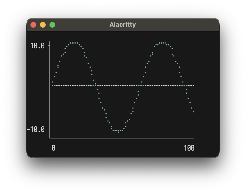
Line Plot
let sinePoints = [(x, sin x) | x <- [0, 0.1 .. 10.0]]
plotLine 40 10 [Series sinePoints "sine" ColorBrightCyan]
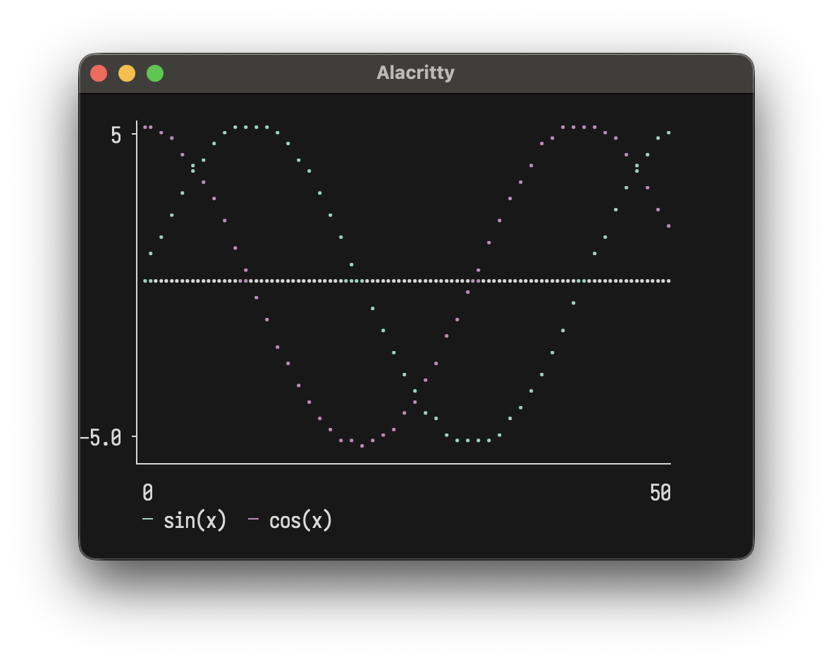
Multiple series:
let sinPts = [(x, sin (x * 0.15) * 5) | x <- [0..50]]
    cosPts = [(x, cos (x * 0.15) * 5) | x <- [0..50]]
plotLine 50 12
  [ Series sinPts "sin(x)" ColorBrightCyan
  , Series cosPts "cos(x)" ColorBrightMagenta
  ]
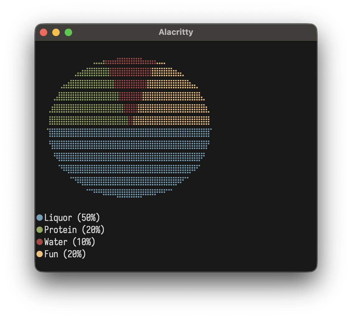
Pie Chart
plotPie 20 10
  [ Slice 50 "A" ColorBrightCyan
  , Slice 30 "B" ColorBrightMagenta
  , Slice 20 "C" ColorBrightYellow
  ]
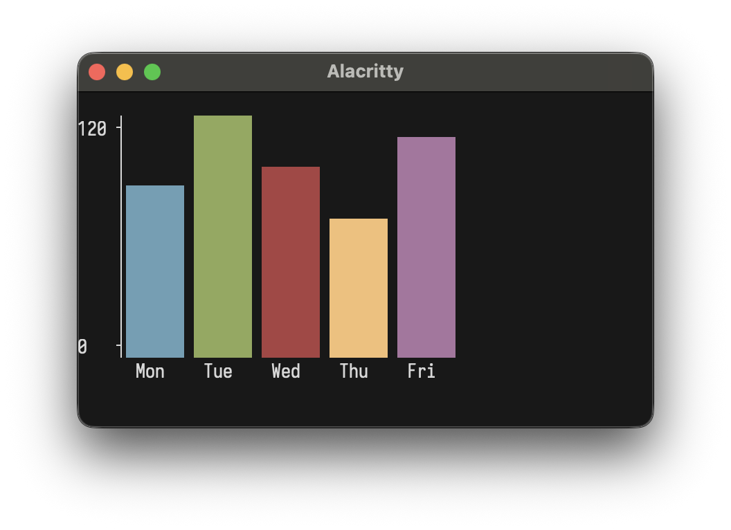
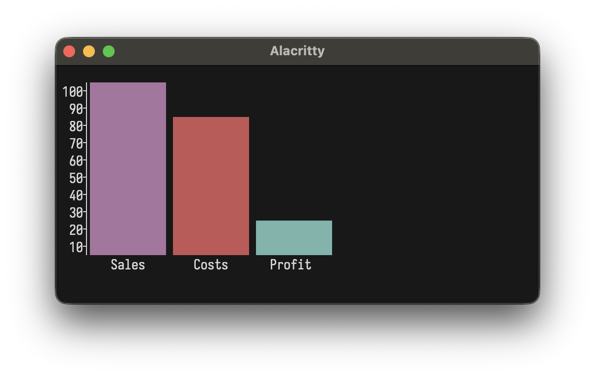
Bar Chart
plotBar 40 10
  [ BarItem 85 "Mon" ColorBrightCyan
  , BarItem 120 "Tue" ColorBrightGreen
  , BarItem 95 "Wed" ColorBrightMagenta
  ]
plotBar 40 10
  [ BarItem 100 "Sales" ColorBrightMagenta
  , BarItem 80  "Costs" ColorBrightRed
  , BarItem 20  "Profit" ColorBrightCyan
  ]
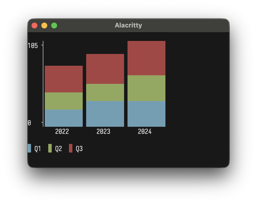
Stacked Bar Chart
plotStackedBar 40 10
  [ StackedBarGroup [BarItem 30 "Q1" ColorDefault, BarItem 20 "Q2" ColorDefault, BarItem 25 "Q3" ColorDefault] "2022"
  , StackedBarGroup [BarItem 35 "Q1" ColorDefault, BarItem 25 "Q2" ColorDefault, BarItem 30 "Q3" ColorDefault] "2023"
  , StackedBarGroup [BarItem 40 "Q1" ColorDefault, BarItem 30 "Q2" ColorDefault, BarItem 35 "Q3" ColorDefault] "2024"
  ]
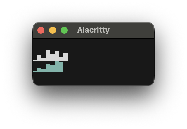
Sparkline
plotSparkline [1, 4, 2, 8, 5, 7, 3, 6]
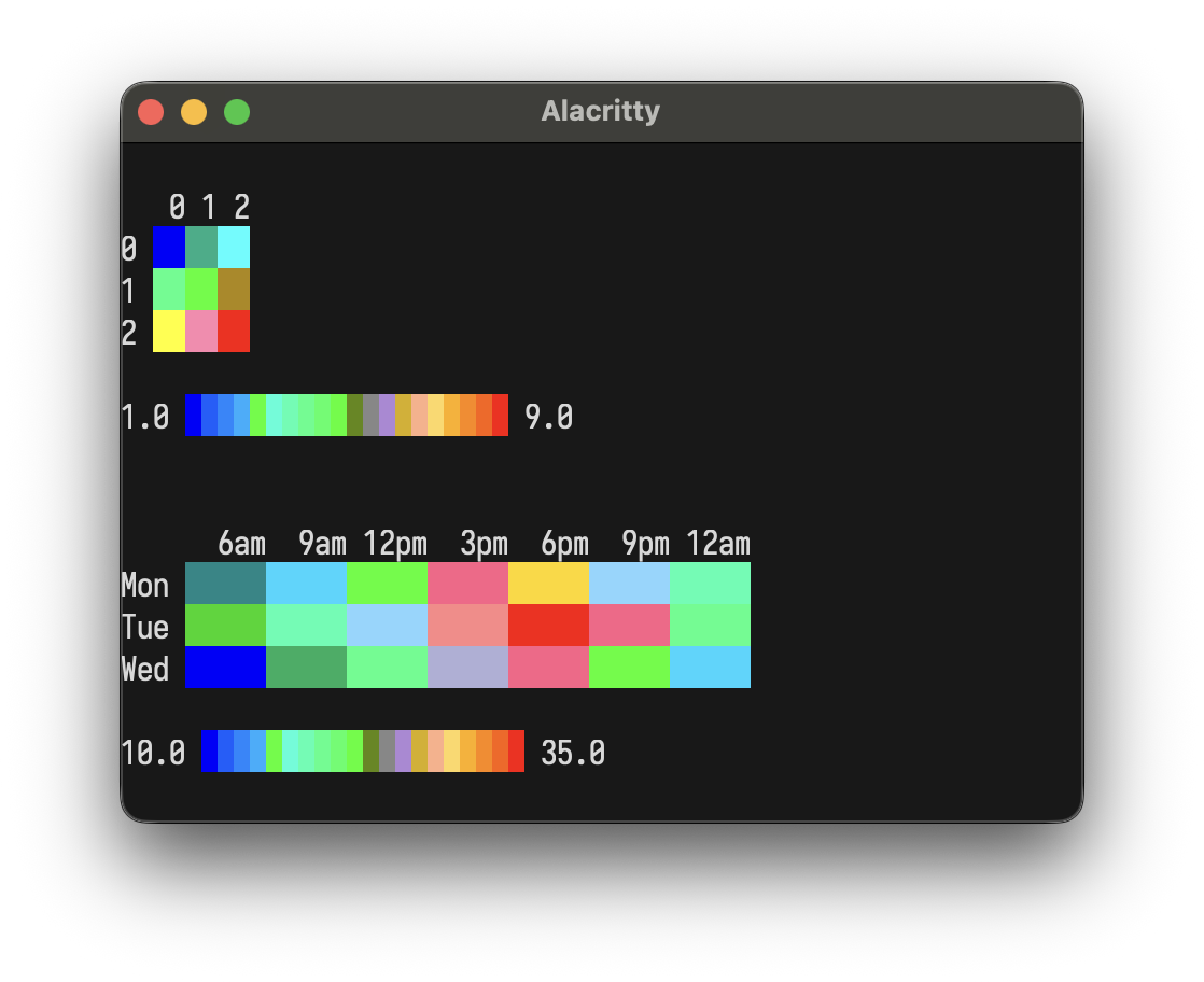
Heatmap
plotHeatmap $ HeatmapData
  [ [12, 15, 22, 28, 30, 25, 18]
  , [14, 18, 25, 32, 35, 28, 20]
  , [10, 13, 20, 26, 28, 22, 15]
  ]
  ["Mon", "Tue", "Wed"]
  ["6am", "9am", "12pm", "3pm", "6pm", "9pm", "12am"]
Colors
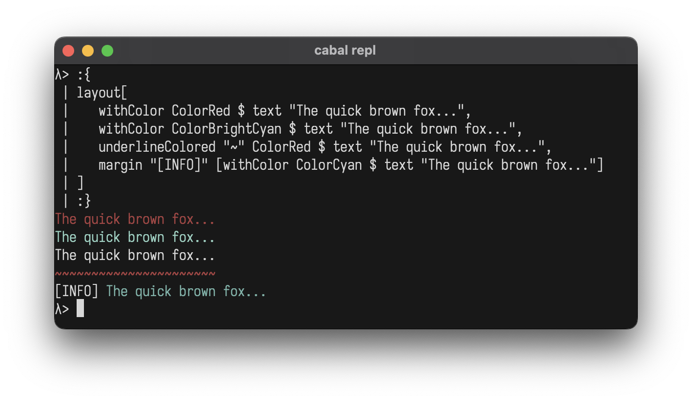
Add ANSI colors to any element:
layout
  [ withColor ColorRed $ text "The quick brown fox..."
  , withColor ColorBrightCyan $ text "The quick brown fox..."
  , underlineColored "~" ColorRed $ text "The quick brown fox..."
  , margin "[INFO]" [withColor ColorCyan $ text "The quick brown fox..."]
  ]
ColorBlack
ColorRed
ColorGreen
ColorYellow
ColorBlue
ColorMagenta
ColorCyan
ColorWhite
ColorBrightBlack              -- Bright 8
ColorBrightRed
ColorBrightGreen
ColorBrightYellow
ColorBrightBlue
ColorBrightMagenta
ColorBrightCyan
ColorBrightWhite
ColorFull 196                 -- 256-color palette (0-255)
ColorTrue 255 128 0           -- 24-bit RGB
ColorDefault                  -- Conditional no-op
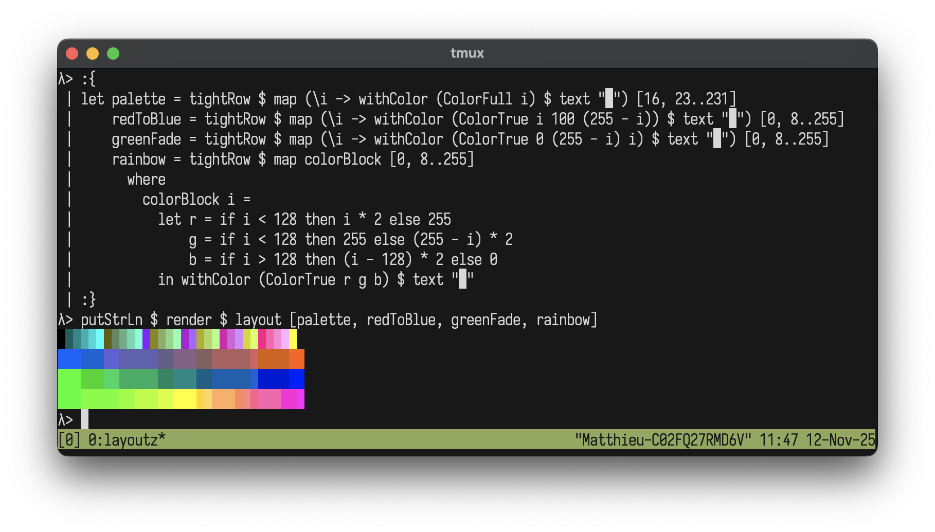
Color Gradients
Create beautiful gradients with extended colors:
let palette   = tightRow $ map (\i -> withColor (ColorFull i) $ text "█") [16, 19..205]
    redToBlue = tightRow $ map (\i -> withColor (ColorTrue i 100 (255 - i)) $ text "█") [0, 4..255]
    greenFade = tightRow $ map (\i -> withColor (ColorTrue 0 (255 - i) i) $ text "█") [0, 4..255]
    rainbow   = tightRow $ map colorBlock [0, 4..255]
      where
        colorBlock i =
          let r = if i < 128 then i * 2 else 255
              g = if i < 128 then 255 else (255 - i) * 2
              b = if i > 128 then (i - 128) * 2 else 0
          in withColor (ColorTrue r g b) $ text "█"

putStrLn $ render $ layout [palette, redToBlue, greenFade, rainbow]
Styles
Add ANSI styles to any element:
layout
  [ withStyle StyleBold $ text "The quick brown fox..."
  , withColor ColorRed $ withStyle StyleBold $ text "The quick brown fox..."
  , withStyle StyleReverse $ withStyle StyleItalic $ text "The quick brown fox..."
  ]
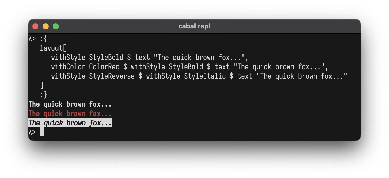
StyleBold
StyleDim
StyleItalic
StyleUnderline
StyleBlink
StyleReverse
StyleHidden
StyleStrikethrough
StyleDefault                  -- Conditional no-op
StyleBold <> StyleItalic      -- Combine with <>
Combining Styles:
Use <> to combine multiple styles at once:
layout
  [ withStyle (StyleBold <> StyleItalic <> StyleUnderline) $ text "The quick brown fox..."
  , withStyle (StyleBold <> StyleReverse) $ text "The quick brown fox..."
  ]
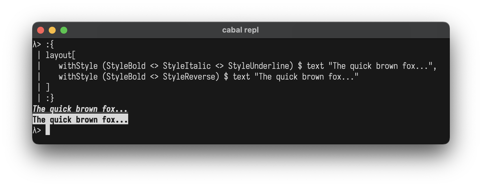
You can also combine colors and styles:
withColor ColorBrightYellow $ withStyle (StyleBold <> StyleItalic) $ text "The quick brown fox..."
Custom Components
Create your own components by implementing the Element typeclass
data Square = Square Int

instance Element Square where
  renderElement (Square size)
    | size < 2 = ""
    | otherwise = intercalate "\n" (top : middle ++ [bottom])
    where
      w = size * 2 - 2
      top = "┌" ++ replicate w '─' ++ "┐"
      middle = replicate (size - 2) ("│" ++ replicate w ' ' ++ "│")
      bottom = "└" ++ replicate w '─' ++ "┘"

-- Helper to avoid wrapping with L
square :: Int -> L
square n = L (Square n)

-- Use it like any other element
putStrLn $ render $ row
  [ square 3
  , square 5
  , square 7
  ]
┌────┐ ┌────────┐ ┌────────────┐
│    │ │        │ │            │
└────┘ │        │ │            │
       │        │ │            │
       └────────┘ │            │
                  │            │
                  └────────────┘
REPL
Drop into GHCi to experiment:
cabal repl
λ> :set -XOverloadedStrings
λ> import Layoutz
λ> putStrLn $ render $ center $ box "Hello" ["World!"]
┌──Hello──┐
│ World!  │
└─────────┘
λ> putStrLn $ render $ table ["A", "B"] [["1", "2"]]
┌───┬───┐
│ A │ B │
├───┼───┤
│ 1 │ 2 │
└───┴───┘
Interactive Apps
LayoutzApp uses the Elm Architecture where your view is simply a layoutz Element.
data LayoutzApp state msg = LayoutzApp
  { appInit          :: (state, Cmd msg)                 -- Initial state + startup command
  , appUpdate        :: msg -> state -> (state, Cmd msg) -- Pure state transitions
  , appSubscriptions :: state -> Sub msg                 -- Event sources
  , appView          :: state -> L                       -- Render to UI
  }
Three daemon threads coordinate rendering (~30fps), tick/timers, and input capture. State updates flow through appUpdate synchronously.
Press ESC to exit.
App Options
Customise how your app runs with runAppWith and the AppOptions record. Override only the fields you need:
runApp app                                                          -- Default options
runAppWith defaultAppOptions { optAlignment = AppAlignCenter } app  -- Centered in terminal
runInline app                                                       -- Animate in-place, no alt screen
runInline renders the app below existing terminal output without clearing the screen. Useful for embedding progress bars or spinners in build scripts... use CmdExit to quit programmatically.
Terminal width is detected once at startup via ANSI cursor position report (zero dependencies).
Subscriptions
subKeyPress (\key -> ...)              -- Keyboard input
subEveryMs 100 msg                     -- Periodic ticks (interval in ms)
subBatch [sub1, sub2, ...]             -- Combine subscriptions
Commands
CmdNone                                -- No effect
CmdExit                                -- Quit the app gracefully
cmdFire (writeFile "log.txt" "entry")  -- Fire and forget IO
cmdTask (readFile "data.txt")          -- IO that returns a message
cmdAfterMs 500 msg                     -- Fire a message after delay (ms)
CmdBatch [cmd1, cmd2, ...]             -- Combine multiple commands
Example: Logger with file I/O
import Layoutz

data Msg = Log | Saved
data State = State { count :: Int, status :: String }

loggerApp :: LayoutzApp State Msg
loggerApp = LayoutzApp
  { appInit = (State 0 "Ready", CmdNone)
  , appUpdate = \msg s -> case msg of
      Log   -> (s { count = count s + 1 },
                cmdFire $ appendFile "log.txt" ("Entry " <> show (count s) <> "\n"))
      Saved -> (s { status = "Saved!" }, CmdNone)
  , appSubscriptions = \_ -> subKeyPress $ \key -> case key of
      KeyChar 'l' -> Just Log
      _           -> Nothing
  , appView = \s -> layout
      [ section "Logger" [text $ "Entries: " <> show (count s)]
      , text (status s)
      , ul ["'l' to log", "ESC to quit"]
      ]
  }

main = runApp loggerApp
Key Types
-- Printable
KeyChar Char                  -- 'a', '1', ' '

-- Editing
KeyEnter                      -- Enter/Return
KeyBackspace                  -- Backspace
KeyTab                        -- Tab
KeyEscape                     -- Escape
KeyDelete                     -- Delete

-- Navigation
KeyUp                         -- Arrow up
KeyDown                       -- Arrow down
KeyLeft                       -- Arrow left
KeyRight                      -- Arrow right

-- Modifiers
KeyCtrl Char                  -- Ctrl+'C', Ctrl+'Q', etc.
KeySpecial String             -- Other unrecognized sequences
Examples
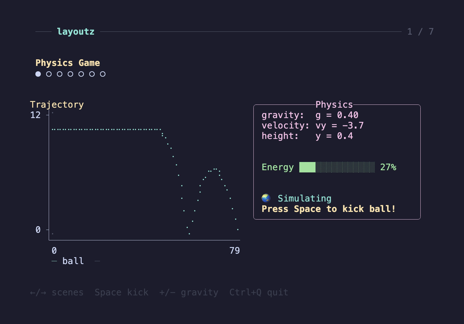
- ShowcaseApp.hs - Tours every layoutz element and visualization across 7 scenes
- SimpleGame.hs - Grid game where you collect gems and dodge enemies with WASD
- InlineBar.hs - Renders a gradient progress bar in-place
- InlineLoadingDemo.hs - Chained inline progress bars in a simulated build script
Contributing
You need GHC (8.10+) and Cabal.
make build         # build library
make test          # run tests
make repl          # GHCi with layoutz loaded
make clean         # clean build artifacts
Fork, make your change, make test, open a PR. Keep it zero-dep.
Inspiration
- Original Scala layoutz.