Visualize Population Pyramids Aggregated by Age.
Age Pyramids in R
apyramid
The goal of {apyramid} is to provide a quick method for visualizing census data stratified by age and one or two categorical variables (e.g. gender and health status). This is a product of the R4EPIs project; learn more at https://r4epis.netlify.app/.
Installation
You can install {apyramid} from CRAN:
install.packages("apyramid")
Click here for alternative installation options
If there is a bugfix or feature that is not yet on CRAN, you can install it via the {drat} package:
# install.packages("drat")
drat::addRepo("R4EPI")
install.packages("apyramid")
You can also install the in-development version from GitHub using the {remotes} package (but there’s no guarantee that it will be stable):
# install.packages("remotes")
remotes::install_github("R4EPI/apyramid")
The {apyramid} package was primarily designed for quick visualisation of un-aggregated linelist data in field epidemiological situations. It has one available function:
age_pyramid()returns age pyramid visualizations of linelist, survey, or pre-aggregated census data as aggplotobject.
library("apyramid")
library("ggplot2")   # load ggplot2 to control plot aesthetics
library("outbreaks") # load the outbreaks package for linelist data
old_theme <- theme_set(theme_classic(base_size = 18))
Example
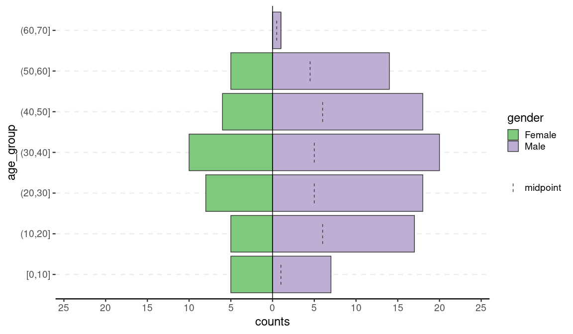
We can demonstrate plotting of un-aggregated data with the fluH7N9_china_2013 data set in the {outbreaks} package that records 136 cases of Influenza A H7N9 in China in 2013 (source: https://doi.org/10.5061/dryad.2g43n)
flu <- outbreaks::fluH7N9_china_2013

# data preparation (create age groups from ages)
autocut <- function(x) {
  cut(x, breaks = pretty(x), right = TRUE, include.lowest = TRUE)
}
flu$age_group <- autocut(as.integer(flu$age))
levels(flu$gender) <- c("Female", "Male")
head(flu)
#>   case_id date_of_onset date_of_hospitalisation date_of_outcome outcome gender
#> 1       1    2013-02-19                    <NA>      2013-03-04   Death   Male
#> 2       2    2013-02-27              2013-03-03      2013-03-10   Death   Male
#> 3       3    2013-03-09              2013-03-19      2013-04-09   Death Female
#> 4       4    2013-03-19              2013-03-27            <NA>    <NA> Female
#> 5       5    2013-03-19              2013-03-30      2013-05-15 Recover Female
#> 6       6    2013-03-21              2013-03-28      2013-04-26   Death Female
#>   age province age_group
#> 1  87 Shanghai   (50,60]
#> 2  27 Shanghai    [0,10]
#> 3  35    Anhui   (10,20]
#> 4  45  Jiangsu   (10,20]
#> 5  48  Jiangsu   (10,20]
#> 6  32  Jiangsu    [0,10]

flup <- age_pyramid(flu, age_group, split_by = gender)
#> Warning: 2 missing rows were removed (0 values from `age_group` and 2 values
#> from `gender`).
flup
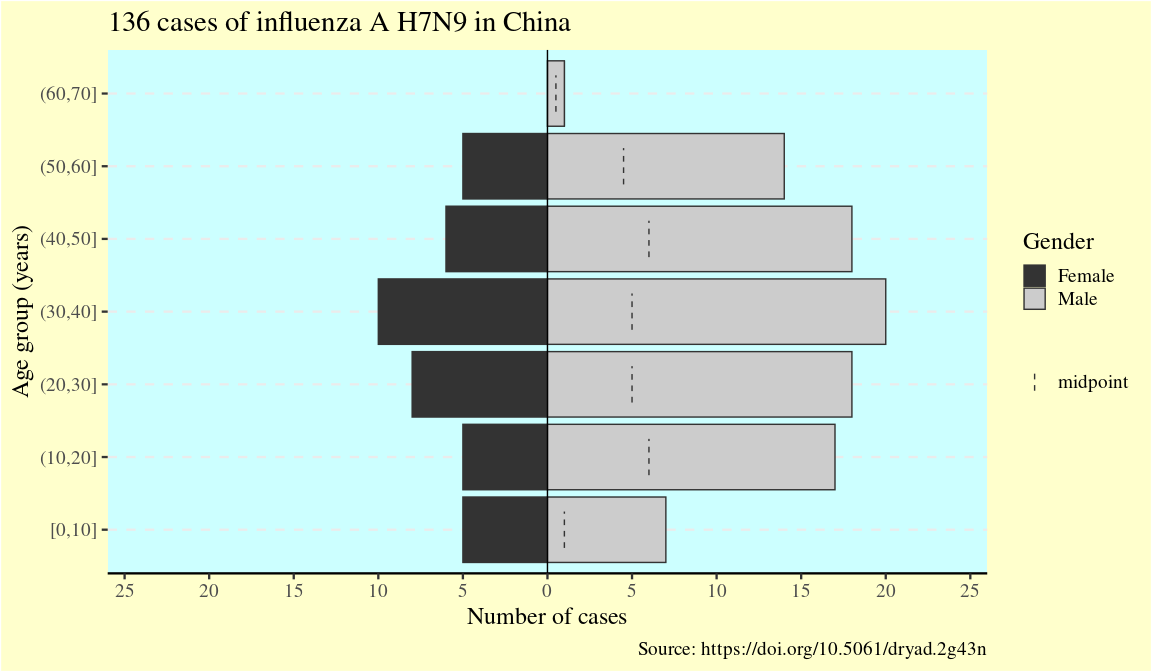
Since the result is a ggplot2 object, it can be customized like one:
flup +
  scale_fill_grey(guide = guide_legend(order = 1)) +
  theme(text = element_text(size = 18, family = "serif")) +
  theme(panel.background = element_rect(fill = "#ccffff")) +
  theme(plot.background = element_rect(fill = "#ffffcc")) +
  theme(legend.background = element_blank()) +
  labs(
    x       = "Age group (years)",
    y       = "Number of cases",
    fill    = "Gender",
    title   = "136 cases of influenza A H7N9 in China",
    caption = "Source: https://doi.org/10.5061/dryad.2g43n"
  )
#> Scale for fill is already present.
#> Adding another scale for fill, which will replace the existing scale.
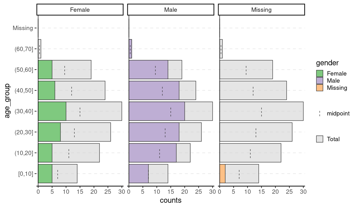
One of the advantages of {apyramid} is that it will adjust to account for non-binary categorical variables. For example, in the flu data set, there are two cases with no gender reported. If we set na.rm = FALSE, we can the age distribution of these two cases:
age_pyramid(flu, age_group, split_by = gender, na.rm = FALSE)
Pre-aggregated data
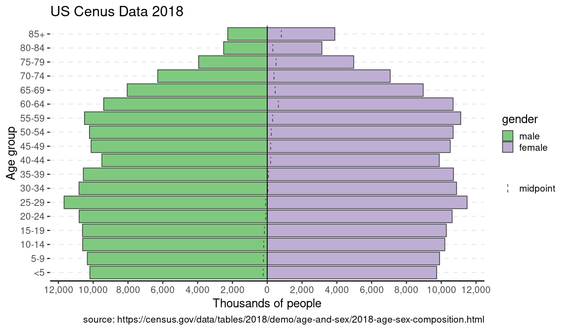
{apyramid} can also be used to visualize pre-aggregated data. This example is the US census data from 2018:
us_labels <- labs(
  x = "Age group",
  y = "Thousands of people",
  title = "US Cenus Data 2018",
  caption = "source: https://census.gov/data/tables/2018/demo/age-and-sex/2018-age-sex-composition.html"
)

data(us_2018)
us_2018
#> # A tibble: 36 × 4
#>    age   gender count percent
#>    <fct> <fct>  <int>   <dbl>
#>  1 <5    male   10193     6.4
#>  2 <5    female  9736     5.9
#>  3 5-9   male   10338     6.5
#>  4 5-9   female  9905     6
#>  5 10-14 male   10607     6.7
#>  6 10-14 female 10204     6.2
#>  7 15-19 male   10617     6.7
#>  8 15-19 female 10291     6.2
#>  9 20-24 male   10809     6.8
#> 10 20-24 female 10625     6.4
#> # … with 26 more rows
p <- age_pyramid(us_2018, age_group = age, split_by = gender, count = count)
p + us_labels
You can also use another factor to split the data:
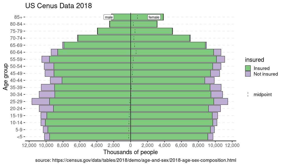
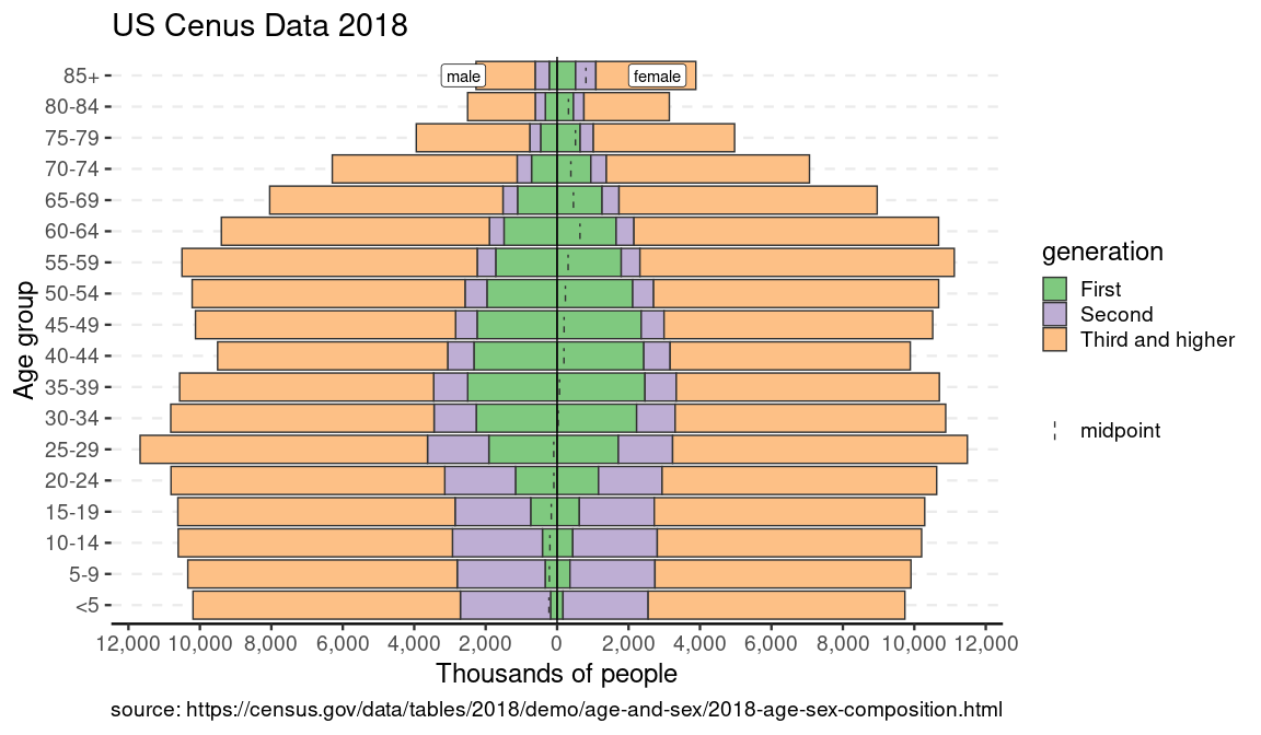
data(us_ins_2018) # stratified by gender and health insurance status
data(us_gen_2018) # stratified by gender and generational status
p_ins <- age_pyramid(us_ins_2018, age_group = age, split_by = gender, stack_by = insured, count = count)
p_gen <- age_pyramid(us_gen_2018, age_group = age, split_by = gender, stack_by = generation, count = count)
p_ins + us_labels
p_gen + us_labels
Survey Data
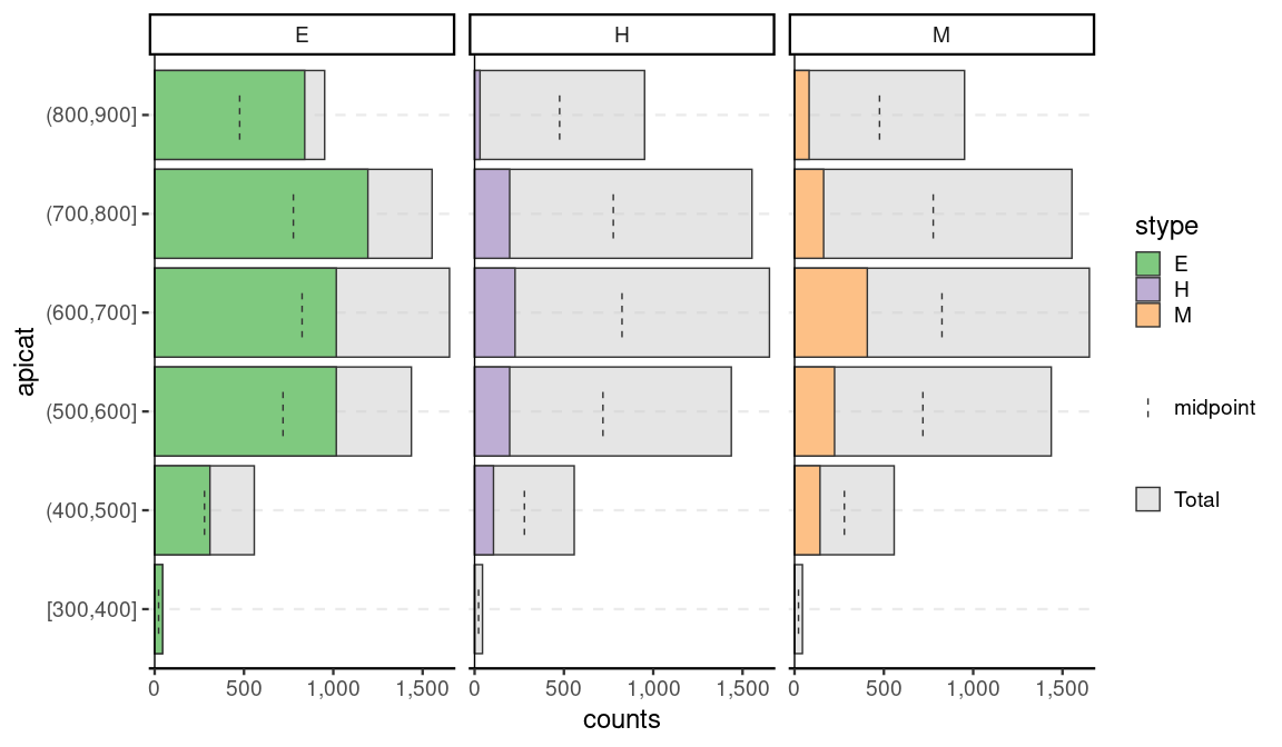
Beyond that, survey data can be incorporated with the help of srvyr. Note that while it will show the weighted counts, it will not show the confidence intervals as that highly depends on the appropriate choice of CI estimator. This is meant as more of quick visualization tool for EDA.
library(srvyr, warn.conflicts = FALSE)
data(api, package = "survey")

dstrata <- apistrat %>%
  mutate(apicat = cut(api00, pretty(api00), include.lowest = TRUE, right = TRUE)) %>%
  as_survey_design(strata = stype, weights = pw)

age_pyramid(dstrata, apicat, split_by = stype)
theme_set(old_theme)
Related work
Population pyramids are common tools for epidemiologists and there are several solutions in R. To our knowledge, the {apyramid} package is the only one that allows for non-binary splitting variable.
