Icon-Based Population Charts and Plots for 'ggplot2'.
ggpop 
![]()
![]()
![]()
![]()


![]()
Turn numbers into people. Turn data into stories.
ggpop is an R package built on top of ggplot2 that simplifies the creation of icon-based population charts. By combining features from ggplot2 and ggimage, ggpop lets users visualize population data using customizable icons arranged in circular layouts. Designed primarily for visual storytelling, ggpop helps users communicate population statistics in an appealing manner.
An Alternative Approach to Visualization
ggpop makes population data easier to remember, allowing users to tell more compelling stories.
- Intuitive Understanding: Proportional representation simplifies data.
- Flexible: Support for 2,000+ Font Awesome icons.
- Fast: Optimized rendering handles up to 1,000 icons smoothly for
geom_pop()and unlimited forgeom_icon_point() - ggplot2 Native: Integrates seamlessly with your existing workflow — themes, facets, scales and all.
Two Main Geoms
Two geoms for different visualization problems:
geom_pop() | geom_icon_point() | |
|---|---|---|
| Best for | Population & proportion data | Any x / y scatter data |
| Layout | Circular proportional grid | Free x / y positioning |
| What one icon means | A fixed share of the total population | A single observation |
| Data prep needed | Yes — run process_data() first (optional) | No — plug in any data directly |
| Think of it as | A pictogram / isotype chart | geom_point() with icons |
Installation
You can install ggpop from CRAN with:
install.packages("ggpop")
Development version of the package can be installed from GitHub with:
install.packages("remotes")
remotes::install_github("jurjoroa/ggpop")
Key Functions & Parameters
| Function / Parameter | Purpose |
|---|---|
process_data() | Convert group counts → one row per icon; use high_group_var for independent per-group sampling (e.g. for faceted charts) |
fa_icons() | Search 2,000+ Font Awesome icons from your R console |
theme_pop() | Built-in minimal theme (also theme_pop_dark(), theme_pop_minimal()) |
scale_legend_icon() | Resize legend icons independently of the plot icons |
arrange | geom_pop() parameter — cluster icons by group (TRUE) or scatter randomly (FALSE, default) |
stroke_width | geom_pop() parameter — add an outline to every icon, in pixels (e.g. stroke_width = 1) |
seed | geom_pop() parameter — fix the random icon layout for reproducible charts (e.g. seed = 42) |
geom_pop() — Population Charts
geom_pop() creates proportional icon grids where each icon represents a share of the total population.
1.- Create a Small Dataset or Use a Built-in Dataset
The dataset df_pop_mx is a minimal example illustrating population counts by sex in Mexico in 2024.
- sex: A categorical variable indicating the sex (
"male"/"female") - n: A numeric variable representing the population size for each sex category
- country: A constant value
"Mexico" - continent: A constant value
"America"
library(dplyr)
library(ggpop)

df_pop_mx <- data.frame(sex = c("male", "female"),
                        n = c(63459580, 67401427),
                        country = "Mexico",
                        continent = "America")
| Sex | Population (n) | Country | Continent |
|---|---|---|---|
| Male | 63,459,580 | Mexico | America |
| Female | 67,401,427 | Mexico | America |
2.- Process data
df_pop_mx_prop <- process_data(data = df_pop_mx,
                               group_var = sex,
                               sum_var = n,
                               sample_size = 1000)
We apply the process_data() function to the population data df_pop_mx with the following parameters:
- group_var = sex: groups the data by sex (male/female). This is our grouping variable
- sum_var = n: uses the column
n(population counts) for group totals. This is the variable that will be summed up to calculate proportions. - sample_size = 1000: generates 1,000 sampled records, proportionally allocated to each group. The package allows up to a sample size of 1000.
The function calculates group proportions, then performs sampling to create a new data frame (df_pop_mx_prop). Each row represents one draw from the 1,000 samples. Notable columns:
- type: which group (male or female) was sampled.
- n: total population count of the corresponding group.
- prop: proportion of that group in the overall dataset.
Note:
process_data()is optional. You can pass your own data frame directly togeom_pop()— as long as each row represents one icon. The maximum is 1,000 rows per plot (you can pass more only if you doing per facet group).
3.- Assign icons to groups
Assign a Font Awesome icon name to each group:
df_pop_mx_prop <- df_pop_mx_prop %>%
  mutate(icon = case_when(
    type == "male" ~ "male",
    type == "female" ~ "female"))
4.- Icons
![]()

Icon names come from the fontawesome package. A sample of available icons:
home · user · envelope · bell · camera · cog · heart · calendar · cart-plus · check · cloud · comment · download · edit · file · filter · flag · folder · phone
![]()
Search from R with fa_icons() or browse the Font Awesome gallery:
fa_icons(query = "person")
5.- Plot population chart
library(ggplot2)
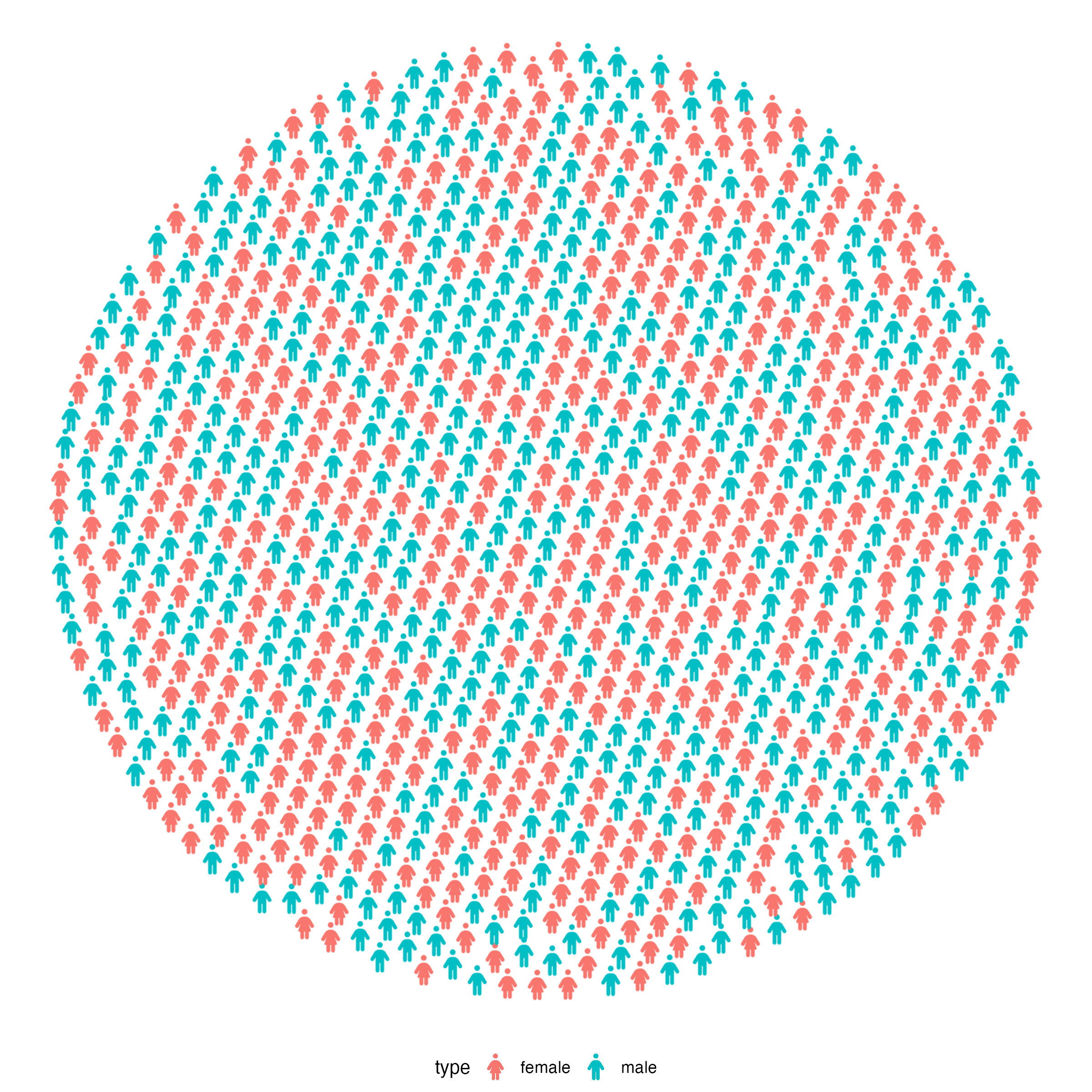
ggplot() +
geom_pop(data = df_pop_mx_prop, aes(icon = icon, color = type),
size = 1, arrange = FALSE, legend_icons = FALSE) +
theme_void() +
theme(legend.position = "bottom")
5.1 Improve the plot
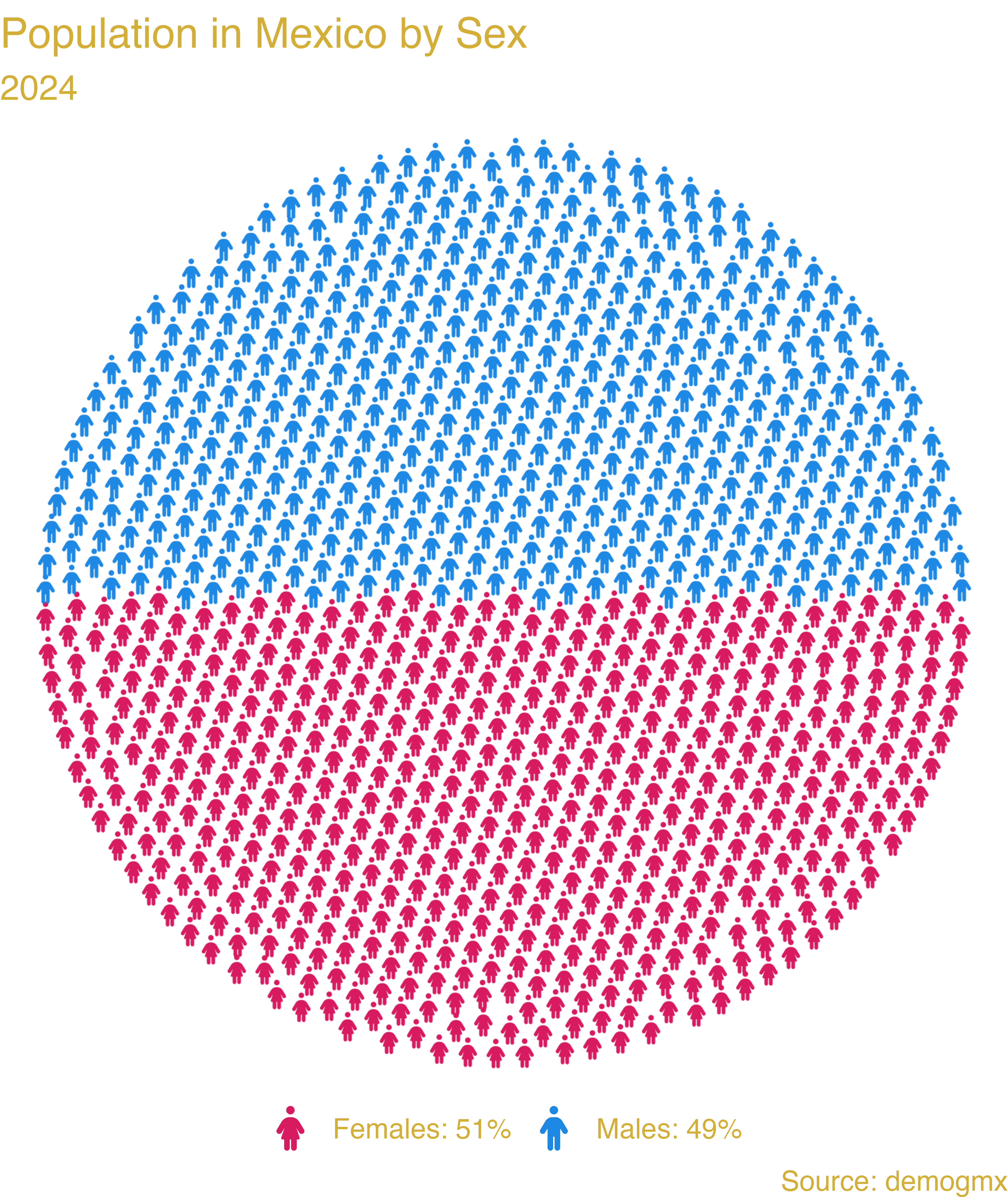
ggplot(data = df_pop_mx_prop, aes(icon = icon, color = type)) +
  geom_pop(size = 1, arrange = TRUE) +
  theme_void(base_size = 40) +
  theme(legend.position = "bottom") +
  labs(title = "Population in Mexico by Sex",
       subtitle = "2024",
       caption = "Source: demogmx") +
  theme(legend.title = element_blank(),
        plot.background = element_blank(),
        panel.background = element_blank(),
        legend.background = element_blank(),
        legend.text = element_text(color = "#D4AF37"),
        plot.title = element_text(color = "#D4AF37"),
        plot.subtitle = element_text(color = "#D4AF37"),
        plot.caption = element_text(color = "#D4AF37")) +
  scale_legend_icon(size = 10) +
  scale_color_manual(values = c("male" = "#1E88E5", "female" = "#D81B60"),
                     labels = c("female" = "Females: 51%", "male" = "Males: 49%"))
Multiple icon types in the same plot:
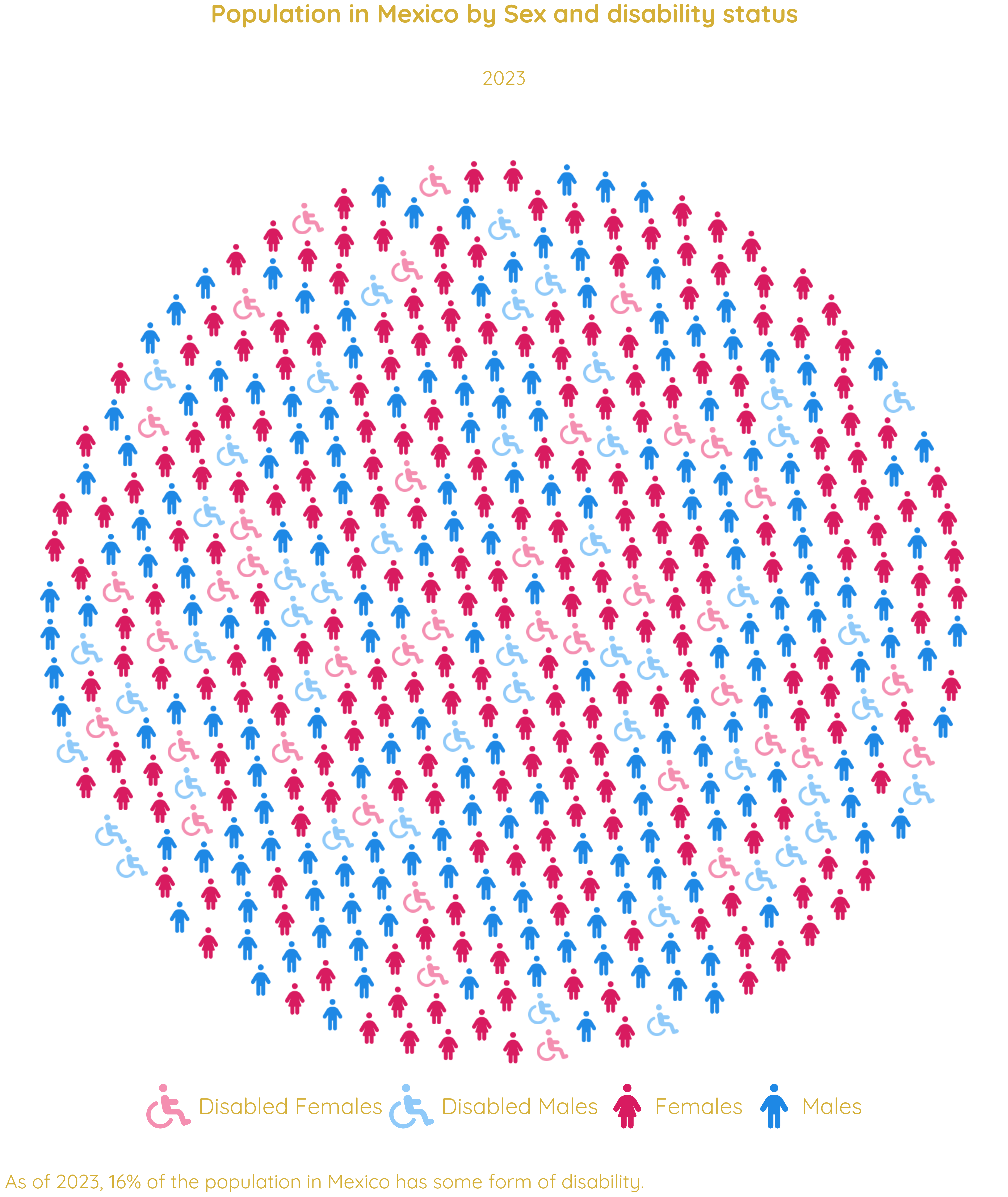
#1.- We load or create the data
df_pop_dis_mx <- data.frame(sex = c("male", "female", "disabled males",
                                    "disabled females"),
                            value = c(53726732, 54978806, 9731396, 11106712),
                            country = "Mexico",
                            continent = "America")

#2.- We process the data
df_pop_dis_mx_prop <- process_data(data = df_pop_dis_mx, group_var = sex,
                                   sum_var = value, sample_size = 500)

#3.- Assign icons to groups
df_pop_dis_mx_prop <- df_pop_dis_mx_prop %>%
  mutate(icon = case_when(
    type == "male" ~ "male",
    type == "female" ~ "female",
    type == "disabled males" ~ "wheelchair",
    type == "disabled females" ~ "wheelchair"))

#4.- Plot

library(showtext)
font_add_google("Quicksand", "quicksand")
showtext_auto()

ggplot(data = df_pop_dis_mx_prop, aes(icon = icon, color = type)) +
  geom_pop(size = 1.1, arrange = FALSE) +
  theme_pop(base_size = 100, base_family = "quicksand") +
  scale_legend_icon(size = 10,
                    legend.text = element_text(color = "#D4AF37",
                                               family = "quicksand"),
                    plot.title = element_text(color = "#D4AF37",
                                               family = "quicksand",
                                              face = "bold", size = 90,
                                              hjust = 0.5),
                    plot.subtitle = element_text(color = "#D4AF37",
                                                 family = "quicksand",
                                                 size = 70, hjust = 0.5),
                    plot.caption = element_text(color = "#D4AF37",
                                                family = "quicksand",
                                                size = 70, hjust = 0)) +
  labs(title = "Population in Mexico by Sex and disability status",
       subtitle = "2023",
       caption = "As of 2023, 16% of the population in Mexico
                  has some form of disability.") +
  theme(legend.position = "bottom", legend.title = element_blank(),
        legend.box.spacing = unit(-.4, "cm"),
        legend.margin = margin(t = 0, b = 0),
        legend.box.margin = margin(t = 0, b = 0)) +
  scale_color_manual(values = c("male" = "#1E88E5", "female" = "#D81B60",
                                "disabled males" = "#90CAF9",
                                "disabled females" = "#F48FB1"),
                     labels = c("male" = "Males", "female" = "Females",
                                "disabled females" = "Disabled Females",
                                "disabled males" = "Disabled Males"))
geom_icon_point() — Icon Scatter Plots
geom_icon_point() works like geom_point() but replaces dots with icons. No preprocessing required.
Key differences from geom_pop()
- No
process_data()step needed — works with raw data - Icons are placed freely at x / y coordinates, not arranged in a grid
- Each icon = one row in your dataset (not a population share)
- Supports mapped icons: different categories can show different icons
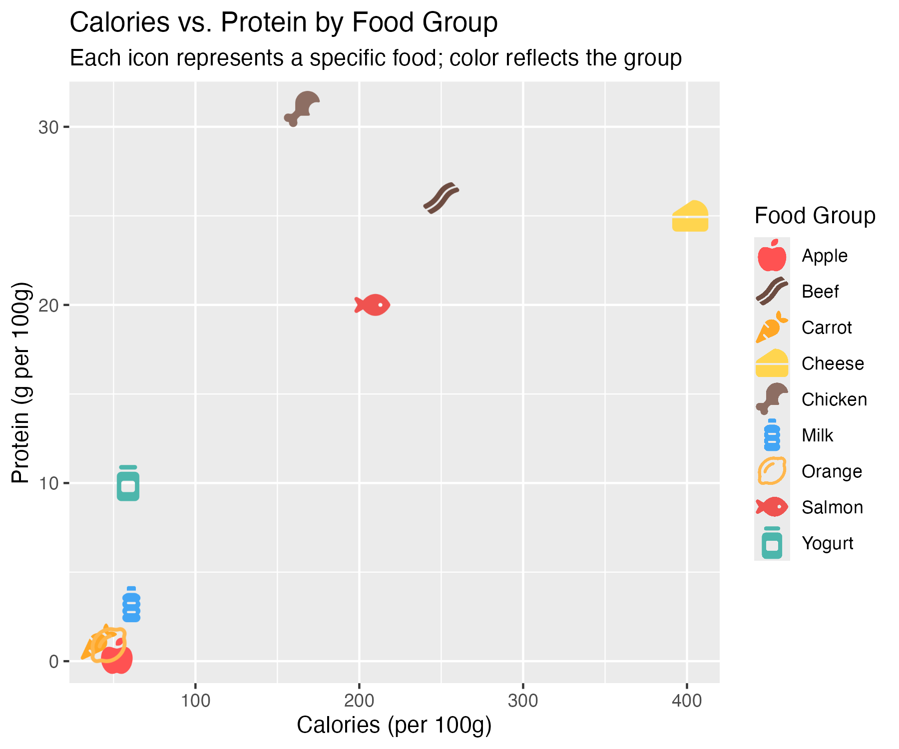
Example 1: Diet & Health Outcomes by Food Group
Each food item plotted by calorie and protein content, with a matching icon and color by category.
library(ggplot2)
library(ggpop)

df_food <- data.frame(
  food     = c("Apple", "Carrot", "Orange", "Chicken", "Beef", "Salmon",
               "Milk", "Cheese", "Yogurt"),
  calories = c(52, 41, 47, 165, 250, 208, 61, 402, 59),
  protein  = c(0.3, 1.1, 0.9, 31, 26, 20, 3.2, 25, 10),
  group    = c(rep("Fruit", 3), rep("Meat", 3), rep("Dairy", 3)),
  icon     = c("apple-whole", "carrot", "lemon",
               "drumstick-bite", "bacon", "fish",
               "bottle-water", "cheese", "jar")
)

ggplot(df_food, aes(x = calories, y = protein, icon = icon, color = food)) +
  geom_icon_point(size = 2, dpi = 100) +
  scale_color_manual(values = c(
    "Apple" = "#FF5252", "Carrot" = "#FFA726", "Orange" = "#FFB74D",
    "Chicken" = "#8D6E63", "Beef" = "#6D4C41",
    "Salmon" = "#EF5350", "Milk" = "#42A5F5", "Cheese" = "#FFD54F",
    "Yogurt" = "#4DB6AC"
  )) +
  labs(
    title = "Calories vs. Protein by Food Group",
    subtitle = "Each icon represents a specific food; color reflects the group",
    x = "Calories (per 100g)",
    y = "Protein (g per 100g)",
    color = "Food Group"
  )
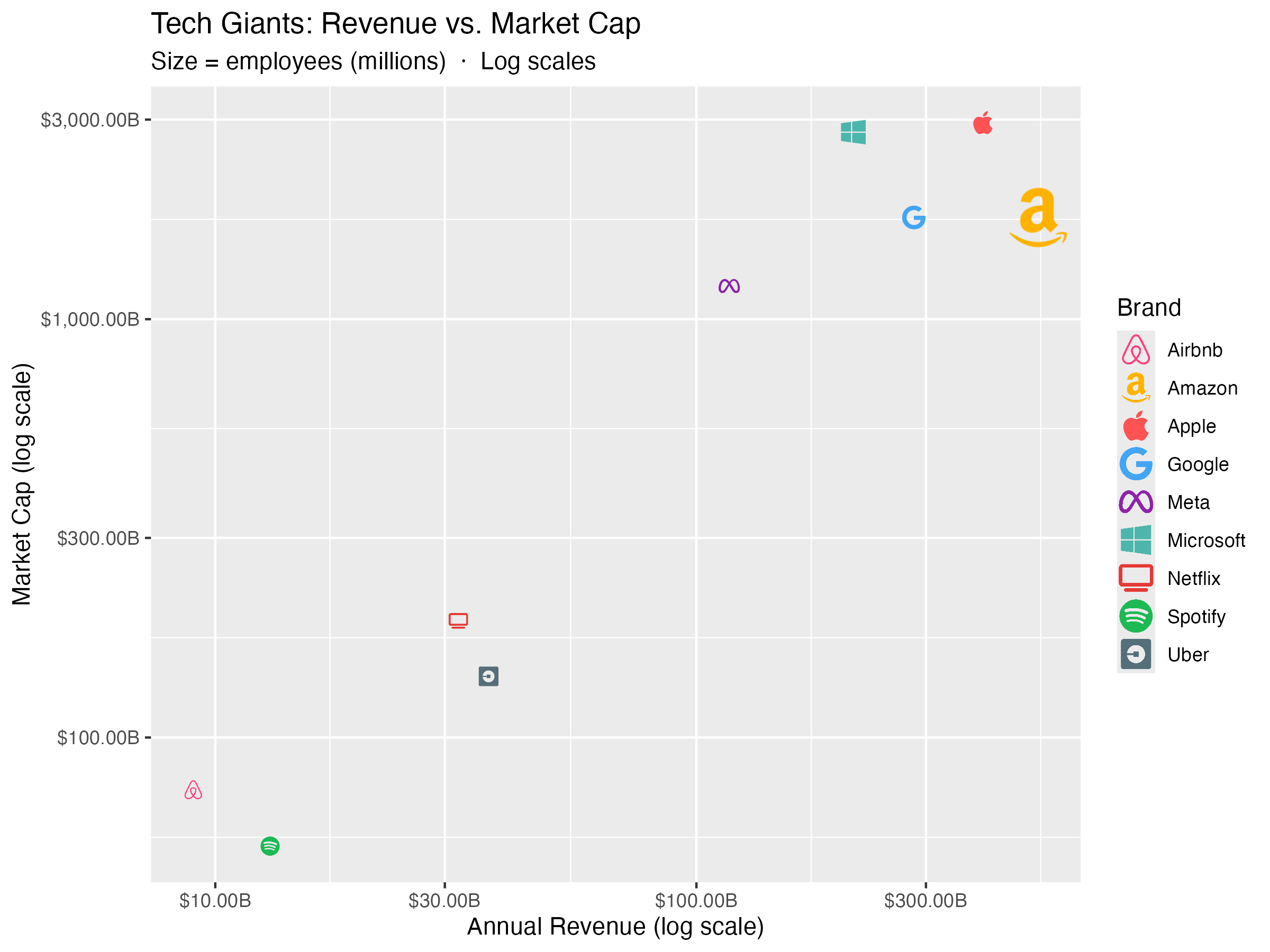
Example 2: Tech Brand Revenue vs. Market Cap
Icon size mapped to number of employees.
library(ggplot2)
library(ggpop)

df_brand <- data.frame(
  brand      = c("Apple", "Google", "Microsoft", "Meta", "Amazon",
                 "Netflix", "Spotify", "Uber", "Airbnb"),
  revenue    = c(394, 283, 212, 117, 514, 32, 13, 37, 9),
  market_cap = c(2950, 1750, 2800, 1200, 1750, 190, 55, 140, 75),
  employees  = c(160, 180, 220, 86, 1540, 13, 9, 32, 6),
  sector     = c("Hardware", "Search", "Cloud", "Social", "Commerce",
                 "Streaming", "Streaming", "Mobility", "Mobility"),
  icon       = c("apple", "google", "windows", "meta", "amazon",
                 "tv", "spotify", "uber", "airbnb")
)

df_brand <- scales::rescale(df_brand, to = c(0.8, 2.5))

ggplot(df_brand, aes(x = revenue, y = market_cap,
                       icon = icon, color = brand, size = size_scaled)) +
  geom_icon_point(dpi = 120) +
  scale_x_log10(labels = scales::dollar_format(suffix = "B")) +
  scale_y_log10(labels = scales::dollar_format(suffix = "B")) +
  scale_color_manual(values = c(
    "Apple"     = "#FF5252", "Google"    = "#42A5F5",
    "Microsoft" = "#4DB6AC", "Meta"      = "#8E24AA",
    "Amazon"    = "#FFB300", "Netflix"   = "#E53935",
    "Spotify"   = "#1DB954", "Uber"      = "#546E7A",
    "Airbnb"    = "#FF4081")) +
  scale_size_continuous(range = c(1, 3), labels = scales::comma) +
  labs(
    title    = "Tech Giants: Revenue vs. Market Cap",
    subtitle = "Size = employees (millions)  ·  Log scales",
    x        = "Annual Revenue (log scale)",
    y        = "Market Cap (log scale)",
    color    = "Brand",
    size     = "Employees (M)"
  )
Featured Example: Cost-Effectiveness of Health Spending
geom_icon_point() combined with calculate_icers(), reference lines, and annotations.
Code available in ggpop package website.
![]()
More Examples: Facets & Other Packages
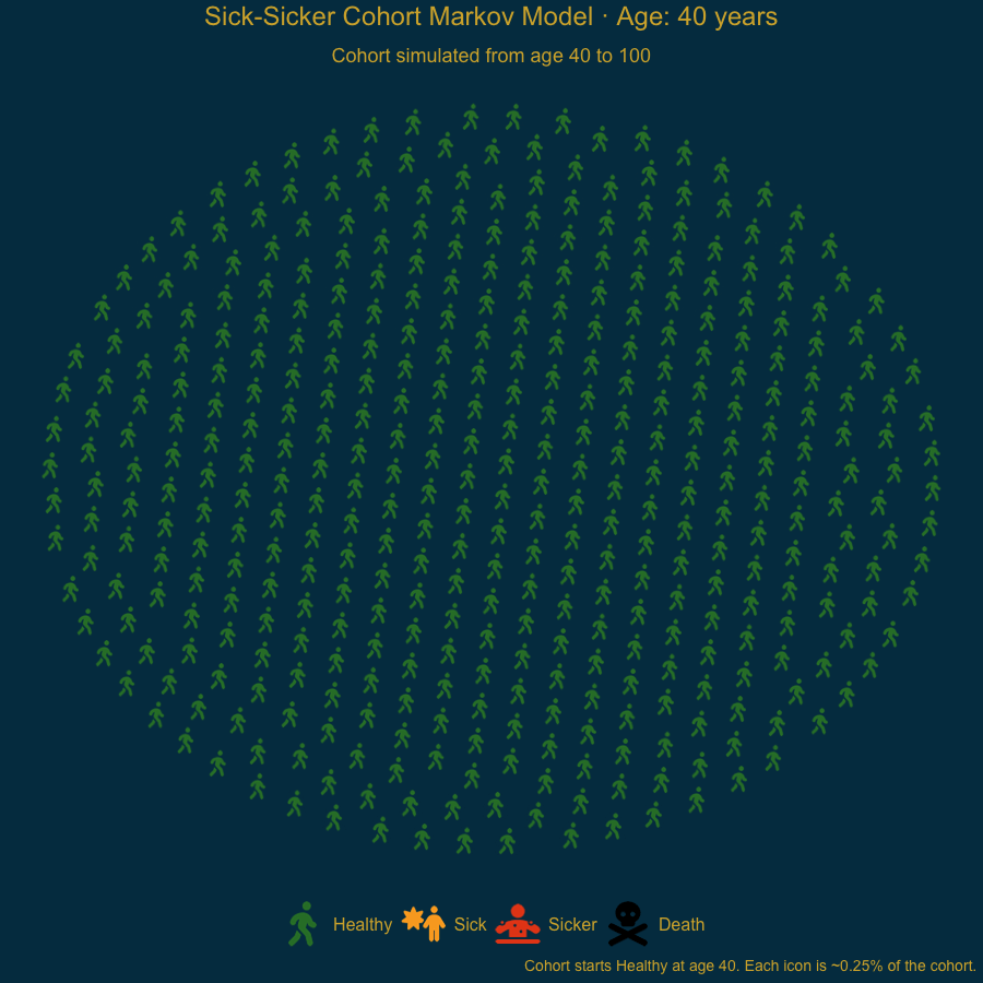
Animated Markov simulation model example
Sick-Sicker cohort animation (ages 40 to 100) built with ggpop and gganimate:
Code available in ggpop package website.
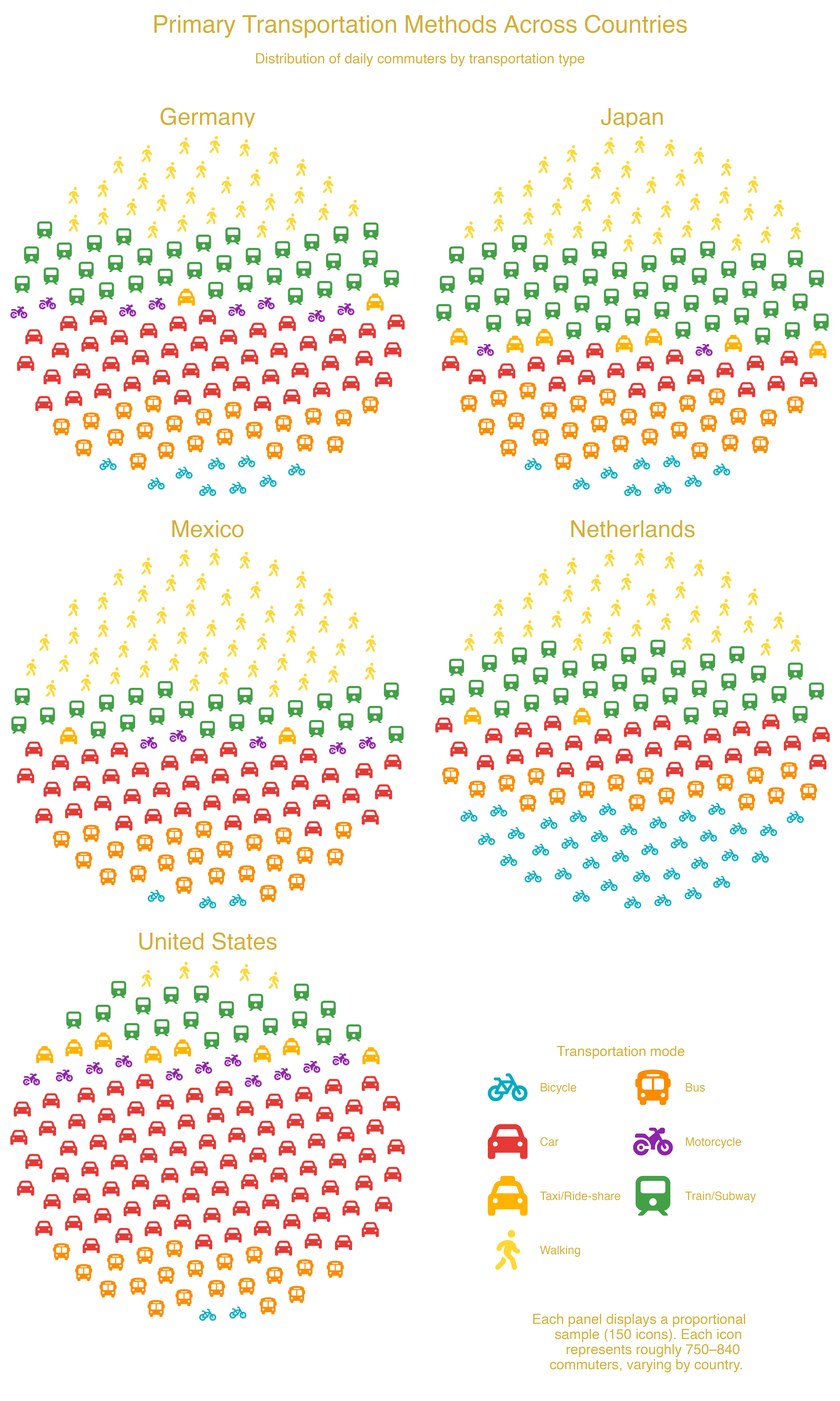
facet_wrap() — Transportation Methods Across US Cities
Transportation methods across cities using facet_wrap(): each panel shows one city's distribution of commute modes.
Code available in ggpop package website.
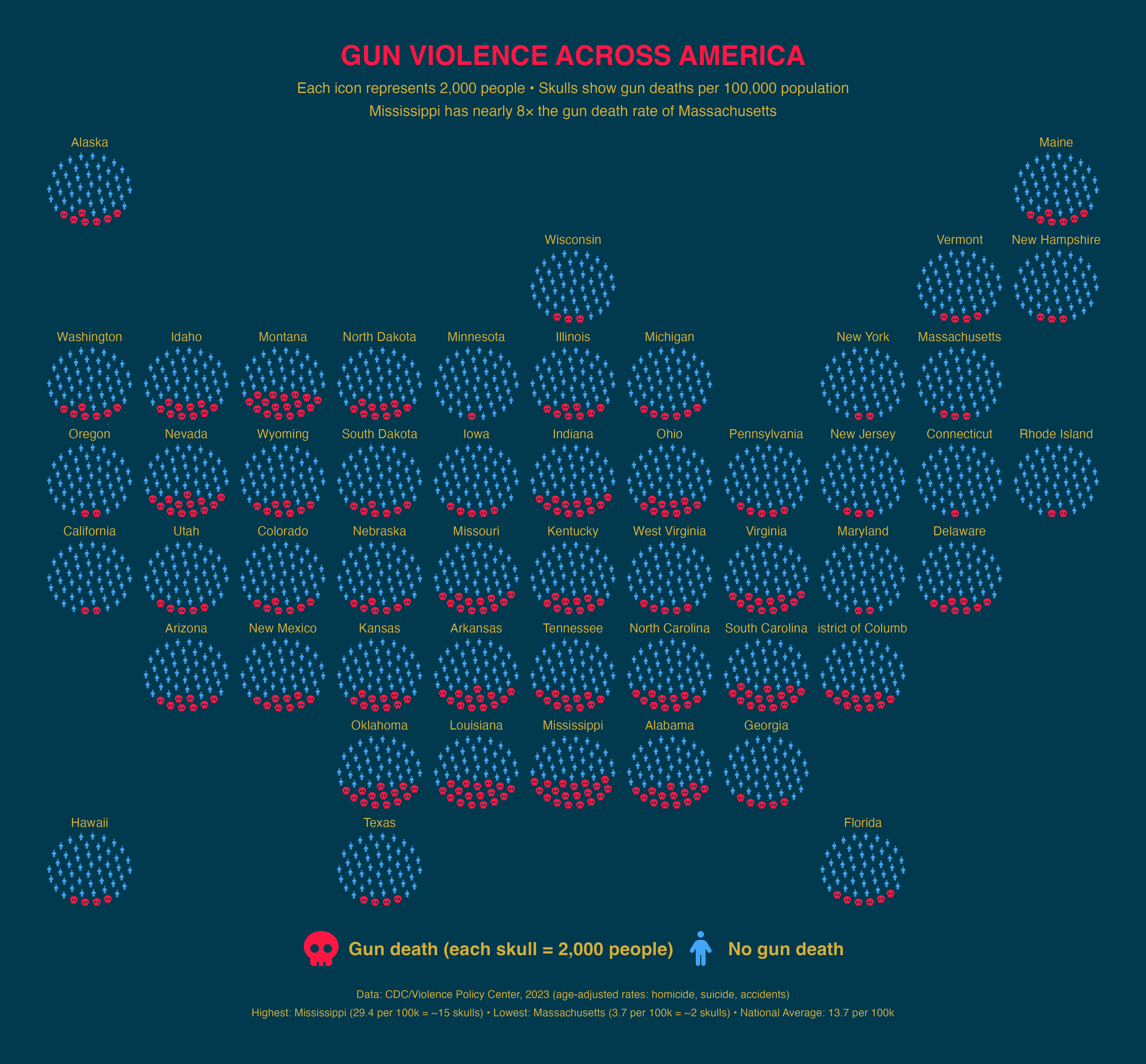
facet_geo() — Gun Violence Across US States
Gun deaths per 100,000 people (2023 CDC data) by US state using geofacet for geographic placement.
Code available in ggpop package website.
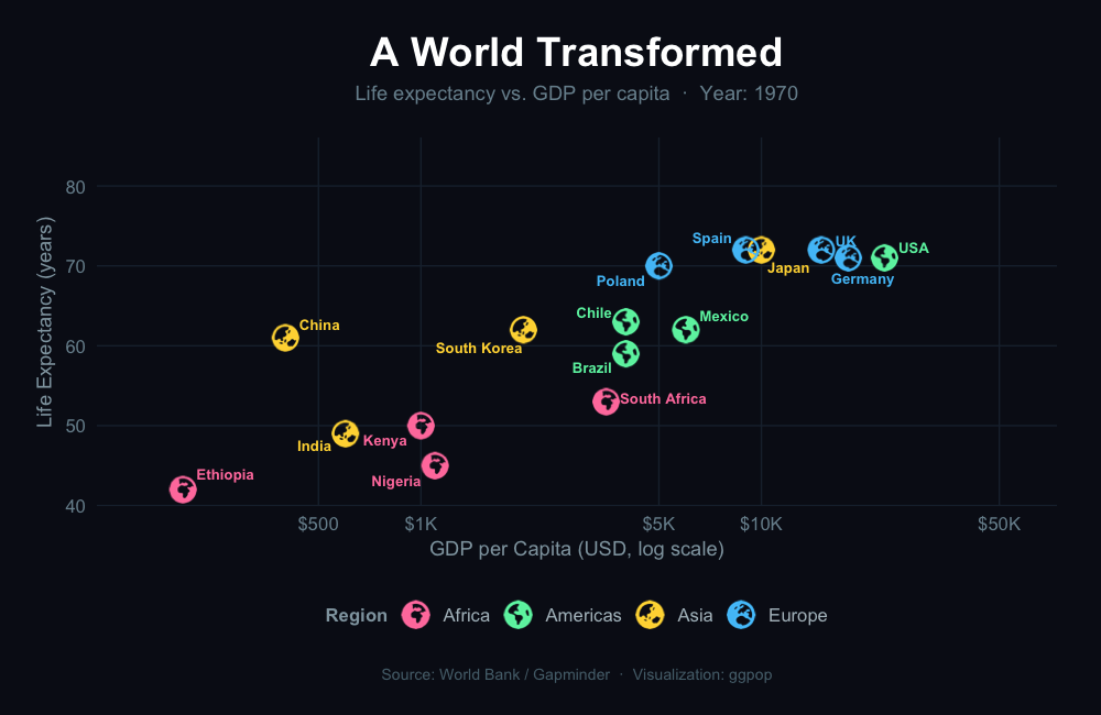
gganimate — A World Transformed
Animated Gapminder-style: life expectancy vs. GDP per capita across five decades, with earth icons by region.
Code available in ggpop package website.
Citation
@Manual{ggpop2024,
  title   = {ggpop: Visualizing Population Data},
  author  = {Roa-Contreras, Jorge A. and
             Soultanova, Ralitza and
             Alarid-Escudero, Fernando and
             Pineda-Antunez, Carlos},
  year    = {2024},
  note    = {R package version 1.7.0},
  url     = {https://github.com/jurjoroa/ggpop},
  license = {MIT}
}