Description
'systemPipeShiny' UI and Server Components.
Description
The systemPipeShiny (SPS) framework comes with many UI and server components. However, installing the whole framework is heavy and takes some time. If you would like to use UI and server components from SPS in your own Shiny apps, do not hesitate to try this package.
README.md
spsComps 
systemPipeShiny Components (spsComps) package is a collection of Shiny custom UI and server components. These components include different kinds of new inputs, buttons, animations, progress loaders and more on the UI side. There are also components like exception handling, validation functions on server side.
Demos
| Demo | type | source code |
|---|---|---|
| shiny | shinyapps.io | Github |
| Rmd | Rmarkdown rendered | Raw |
Install
Install release version from CRAN:
install.packages("spsComps")
Develop version:
if (!requireNamespace("remotes", quietly=TRUE))
    install.packages("remotes")
remotes::install_github("lz100/spsComps")
User manual
Other packages in systemPipeShiny
| Package | Description | Documents | Function reference | Demo |
|---|---|---|---|---|
 systemPipeShiny systemPipeShiny | SPS main package | website | link | demo |
 spsComps spsComps | SPS UI and server components | website | link | demo |
 drawer drawer | SPS interactive image editing tool | website | link | demo |
 spsUtil spsUtil | SPS utility functions | website | link | NA |
some screenshots of spsComps
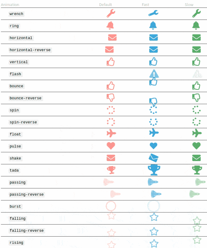
Animations
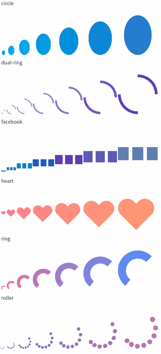
Loaders
Buttons
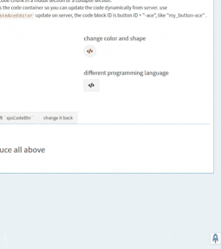
Code display button
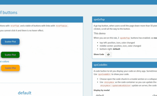
Go top button
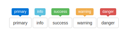
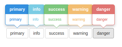
Input buttons

Button groups
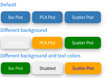
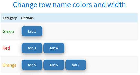
Table of buttons
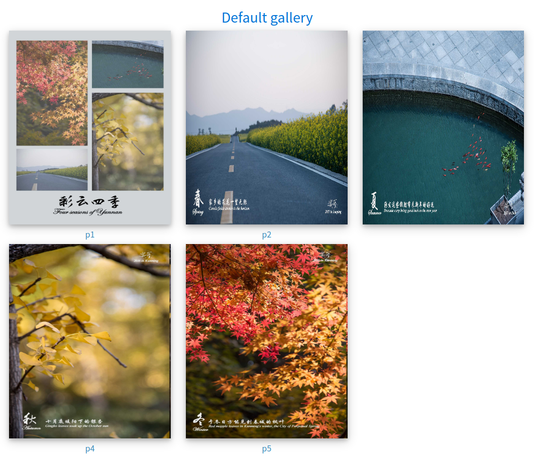
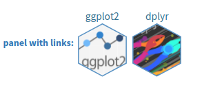
Gallery
Logos
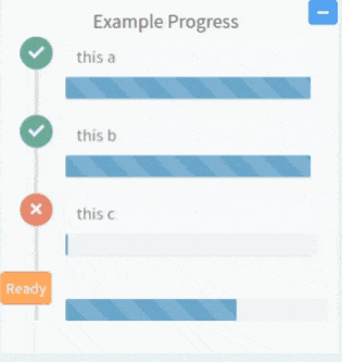
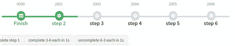
Progress tracking
Porgress panel
Timeline
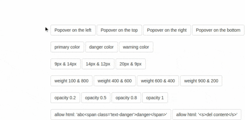
Tooltips
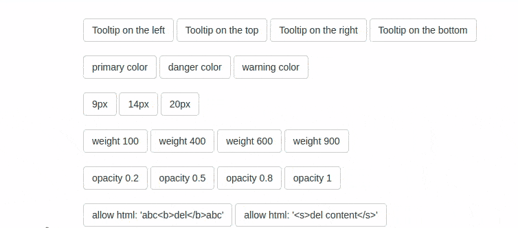
Popovers
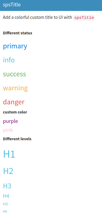
Colorful titles
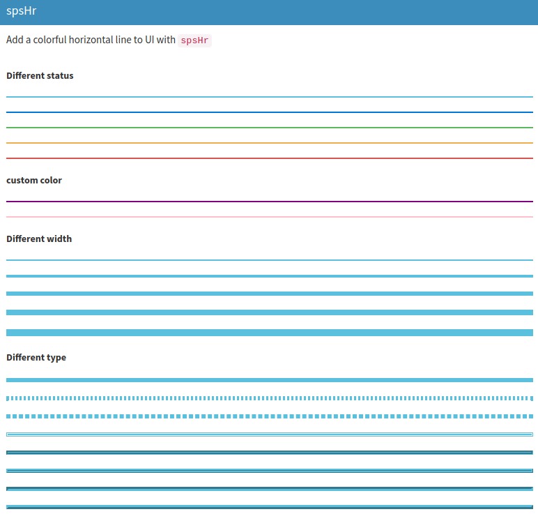
Colorful divider lines.