Description
Datasets with Strong and Spurious Correlations.
Description
Provides datasets from Vigen (2015) <https://web.archive.org/web/20230607181247/https%3A/tylervigen.com/spurious-correlations> rescued from the Internet Wayback Machine. These should be preserved for statistics introductory courses as these make it very clear that correlation is not causation.
README.md
Spurious correlations 
The goal of spuriouscorrelations is to keep alive the amazing examples from Tyler Vigen. Unfortunately, as of 2023-10-09, the website is down as my students noticed. Therefore, I decided to use the snapshot from the Internet Wayback Machine to save the datasets from 2023-06-07.
Installation
You can install the development version of spuriouscorrelations like so:
remotes::install_github("pachadotdev/spuriouscorrelations")
Example
This is a basic example which shows you how to plot a spurious correlation:
library(dplyr)
#>
#> Attaching package: 'dplyr'
#> The following objects are masked from 'package:stats':
#>
#>     filter, lag
#> The following objects are masked from 'package:base':
#>
#>     intersect, setdiff, setequal, union
library(ggplot2)
library(spuriouscorrelations)

unique(spurious_correlations$var2_short)
#>  [1] US spending on science           Nicholas Cage
#>  [3] Cheese consumed                  Age of Miss America
#>  [5] Arcade revenue                   Space launches
#>  [7] Mozzarella cheese consumption    Kentucky marriages
#>  [9] US crude oil imports from Norway Chicken consumption
#> [11] Nuclear power plants             Japanese cars sold
#> [13] Spelling bee letters             Uranium stored
#> 14 Levels: Age of Miss America Arcade revenue ... US spending on science

nicholas_cage <- spurious_correlations %>%
  filter(var2_short == "Nicholas Cage")

ggplot(nicholas_cage) +
  geom_point(aes(x = var1_value, y = var2_value, color = year), size = 4) +
  theme_minimal() +
  labs(
    x = "Drownings by falling into a pool",
    y = "Nicholas Cage movies",
    title = "Drownings by Falling into a Pool vs Nicholas Cage Movies"
  )
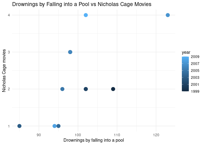
The correlation is:
cor(nicholas_cage$var1_value, nicholas_cage$var2_value)
#> [1] 0.6660043
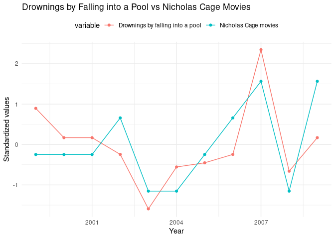
Now let’s make it double-axis:
library(tidyr)

nicholas_cage_long <- nicholas_cage %>%
  select(year, var1_value, var2_value) %>%
  pivot_longer(
    cols = c(var1_value, var2_value),
    names_to = "variable",
    values_to = "value"
  ) %>%
  # standardize the values
  group_by(variable) %>%
  mutate(
    value = (value - mean(value)) / sd(value),
    variable = case_when(
      variable == "var1_value" ~ "Drownings by falling into a pool",
      variable == "var2_value" ~ "Nicholas Cage movies"
    )
  )

# make a double y axis plot with year on the x axis
ggplot(nicholas_cage_long, aes(
  x = year, y = value, color = variable,
  group = variable
)) +
  geom_line() +
  geom_point() +
  theme_minimal() +
  theme(legend.position = "top") +
  labs(
    x = "Year",
    y = "Standardized values",
    title = "Drownings by Falling into a Pool vs Nicholas Cage Movies"
  )