Description
Generate Tidy Charts Inspired by 'IBCS'.
Description
There is a wide range of R packages created for data visualization, but still, there was no simple and easily accessible way to create clean and transparent charts - up to now. The 'tidycharts' package enables the user to generate charts compliant with International Business Communication Standards ('IBCS'). It means unified bar widths, colors, chart sizes, etc. Creating homogeneous reports has never been that easy! Additionally, users can apply semantic notation to indicate different data scenarios (plan, budget, forecast). What's more, it is possible to customize the charts by creating a personal color pallet with the possibility of switching to default options after the experiments. We wanted the package to be helpful in writing reports, so we also made joining charts in a one, clear image possible. All charts are generated in SVG format and can be shown in the 'RStudio' viewer pane or exported to HTML output of 'knitr'/'markdown'.
README.md
tidycharts
The goal of tidycharts is to enable R users to create charts inspired by International Business Communication Standards (IBCS). The plots are generated in SVG format, so embedding them in HTML documents is straight forward.
Installation
You can install the released version of tidycharts from CRAN with:
install.packages("tidycharts")
Development version from GitHub can be installed with:
devtools::install_github("MI2DataLab/tidycharts")
Example
How to create IBCS inspired charts using tidycharts?
library(tidycharts) # load the package

# create some data to visualize
df <- data.frame(months = month.abb[1:6],
                 values = round(5 + sin(1:6), 2))

# create chart in a form of character vector containing SVG content
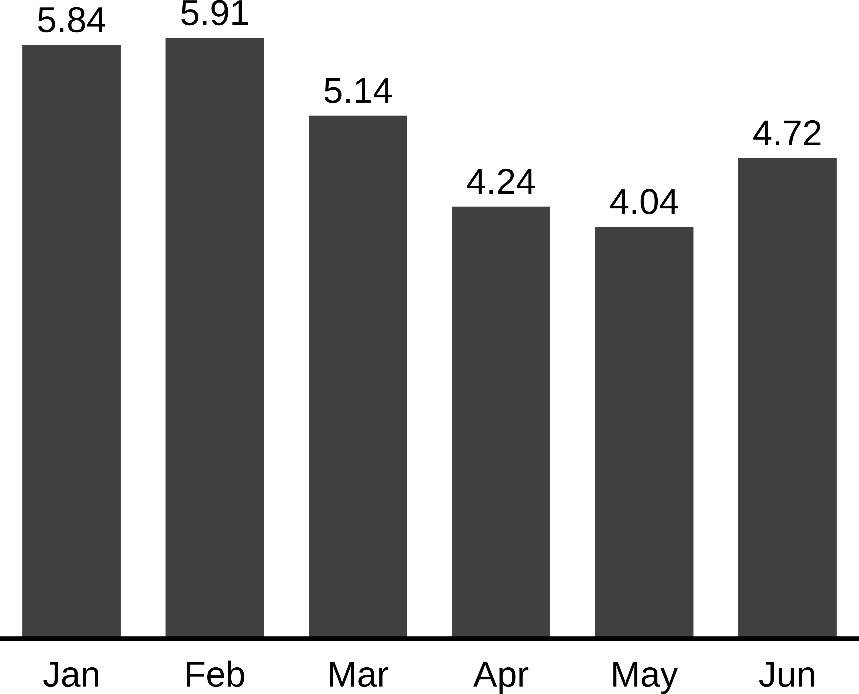
column_chart(df, x = 'months', series = 'values')

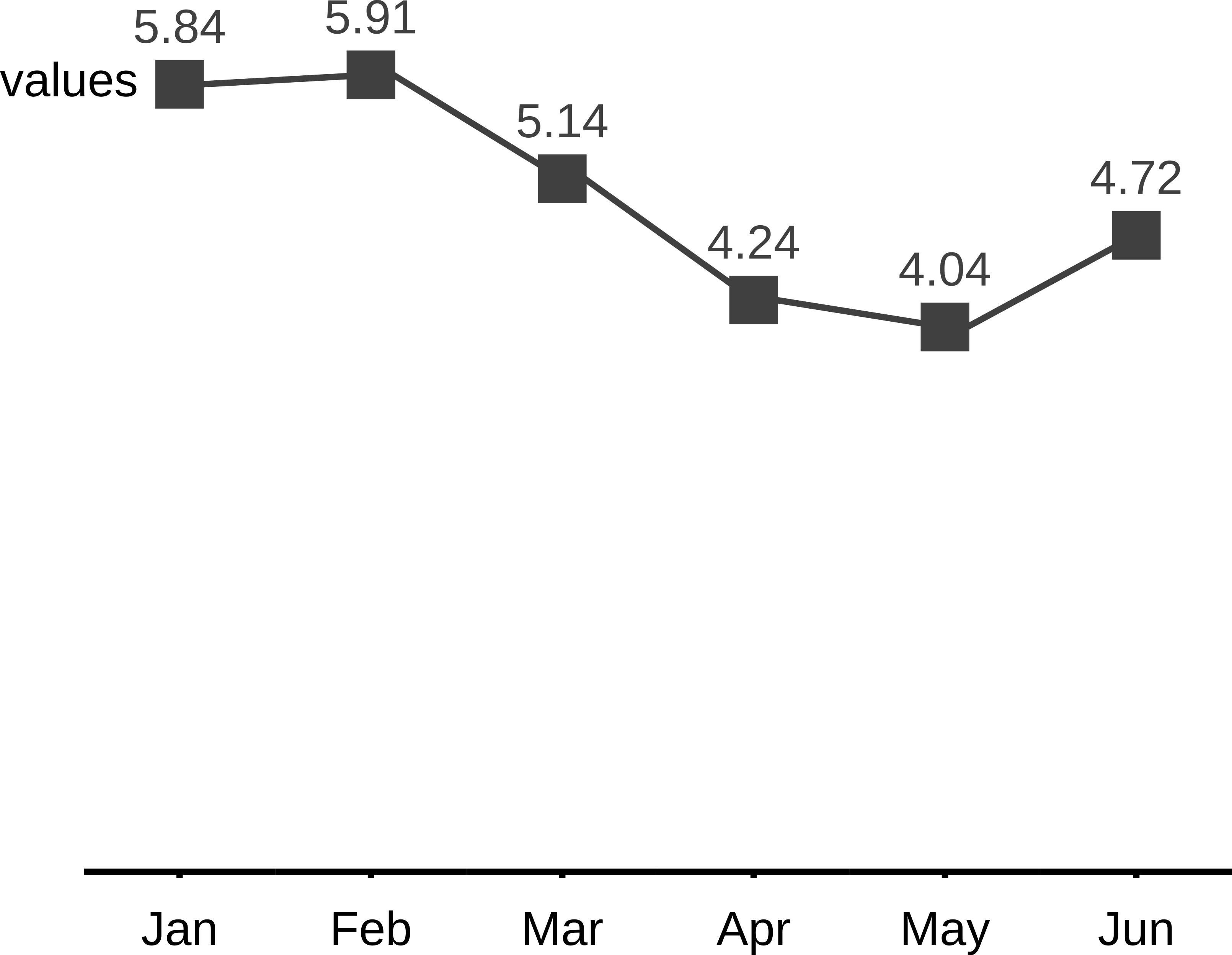
You can easily create other type of plots, ie. lineplots:
line_chart_markers(df, x = df$months, series = 'values', series_labels = 'values')
