Description
Style Time Series Plots Like the Wall Street Journal.
Description
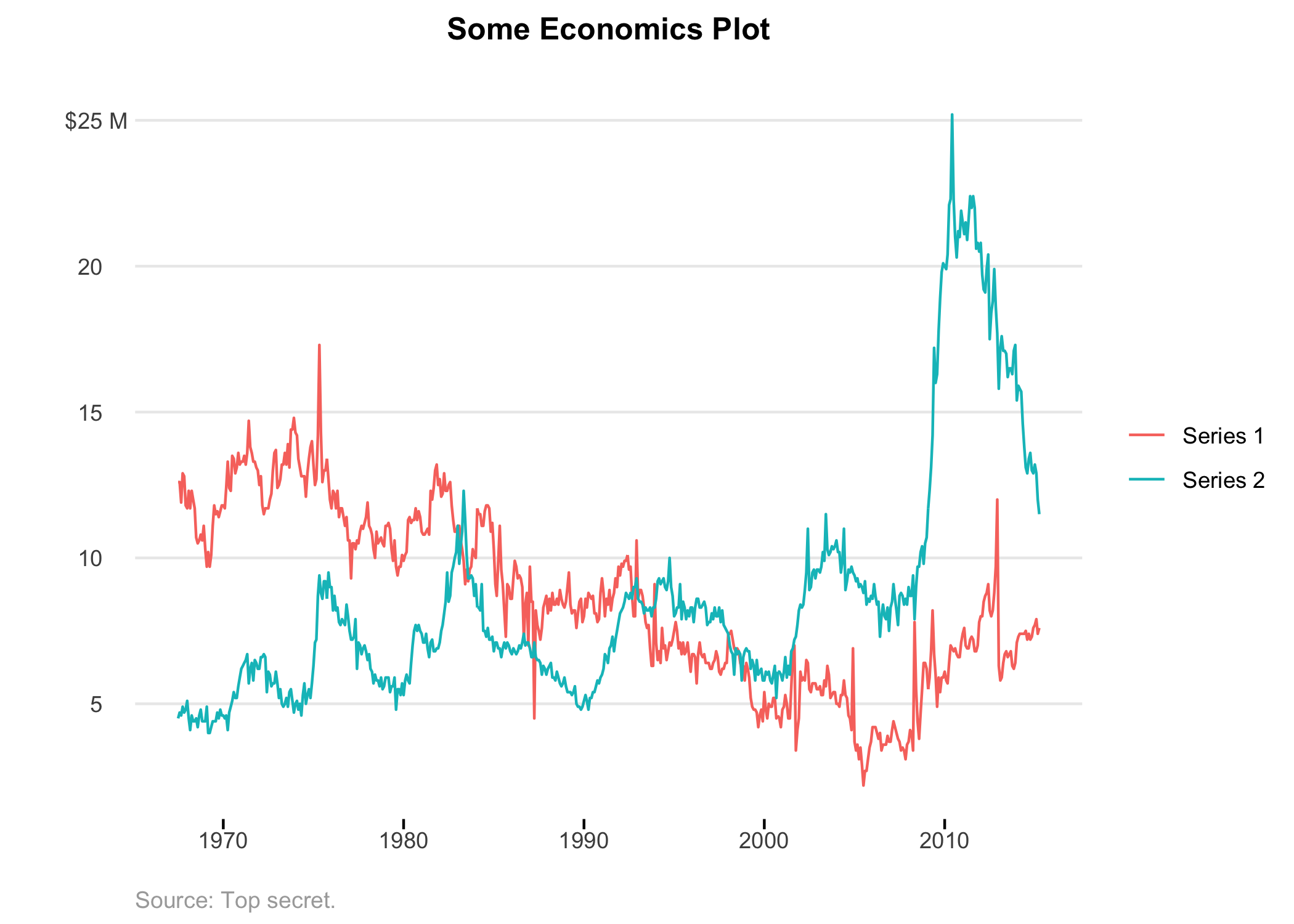
Easily override the default visual choices in 'ggplot2' to make your time series plots look more like the Wall Street Journal. Specific theme design choices include omitting x-axis grid lines and displaying sparse light grey y-axis grid lines. Additionally, this allows to label the y-axis scales with your units only displayed on the top-most number, while also removing the bottom most number (unless specifically overridden). The goal is visual simplicity, because who has time to waste looking at a cluttered graph?
README.md
WSJ Plot
Make ggplot graphs that look like the Wall Street Journal.

Quick Use
Install from CRAN
Coming soon...
Install from GitHub
> devtools::install_github("slee981/wsjplot")
Make plot
 > library(ggplot2)
 > library(dplyr)
 > `%>%` <- magrittr::`%>%`

 > economics_long %>%
       filter(variable %in% c("psavert", "uempmed")) %>%
       ggplot(aes(date, value, color = variable)) +
       geom_line() +
       scale_y_continuous(
           labels = label_wsj(suffix = " M")
       ) +
       scale_color_discrete(
           labels = c("Series 1", "Series 2")
       ) +
       theme_wsj() +
       labs(
           title = "Some Economics Plot",
           caption = "Source: Top secret.",
           y = ""
       )
Functions
theme_wsj(): Sets the default theme. Use as you would anyggplot2::theme_choice().label_wsj(): Formats y-axis ticks such that the top number on the graph has the units, and the rest of the numbers are left visually clean. This also removes the bottom most axis label by default, although this can be overridden. Use in place of anyscales::label_choice().
Contribute
- From your terminal:
$ git clone https://github.com/slee981/wsjplot.git
$ cd wsjplot
- In RStudio:
 > library(devtools)
 > load_all()              # load exported functions into memory
 > test()                  # run tests
 > document()              # update based on roxygen2 doc strings
 > check()                 # full diagnostic tests